725-contact
An application that helps people by providing them immediate contact with people in their contact list, when they are in a device not present situation.
Client: Sigex
Role: Branding, UX/UI Design
Date: Feb. -
Apr. 2021
725Contact helps people by providing them immediate contact with
people in their contact list, when they are in a stressful
situation and a device not present situation. The 725Contact
solution solves the systemic device-not-present problem faced by
an estimated 30 million smartphone-owning individuals annually in
the U.S. alone.
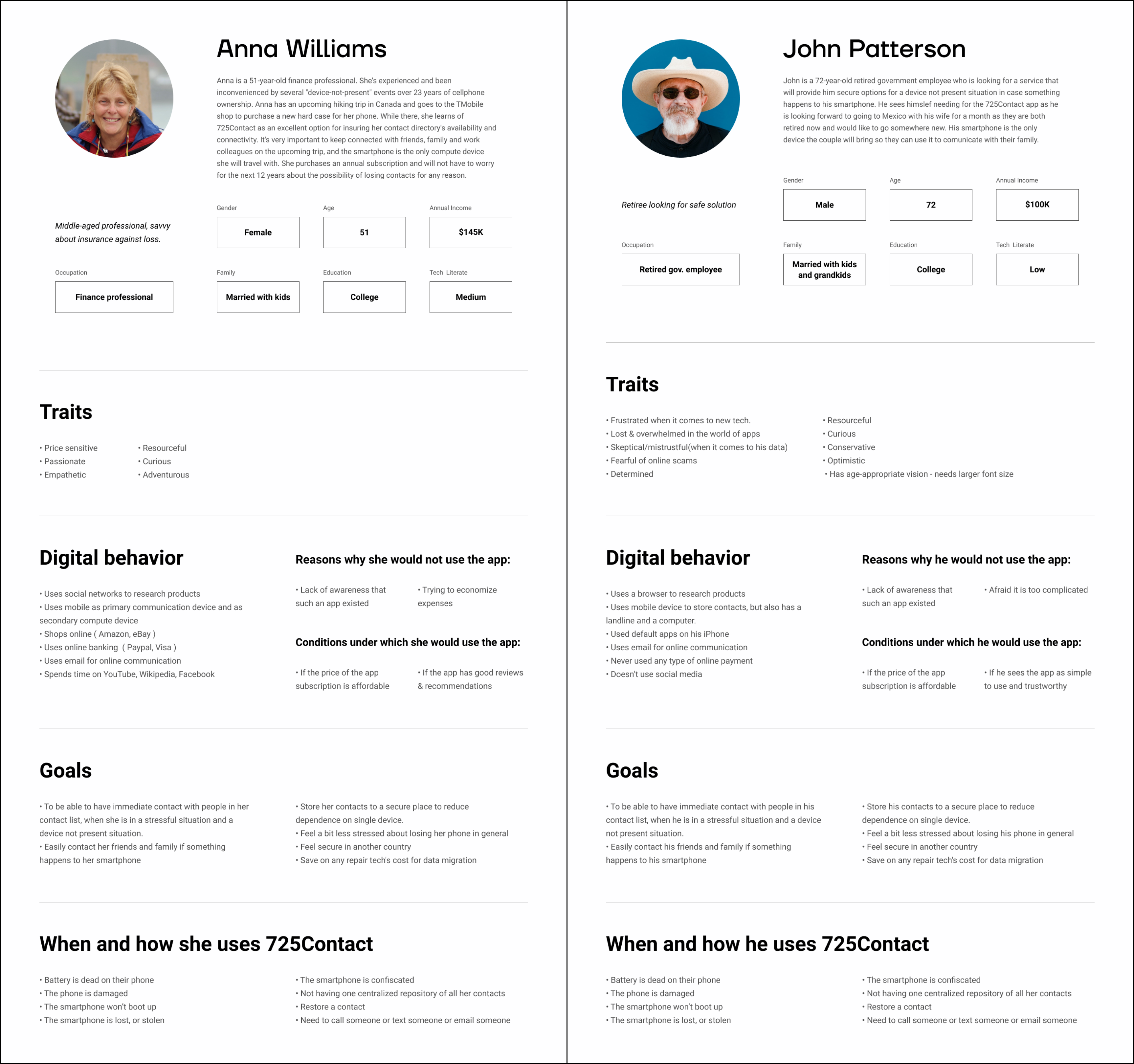
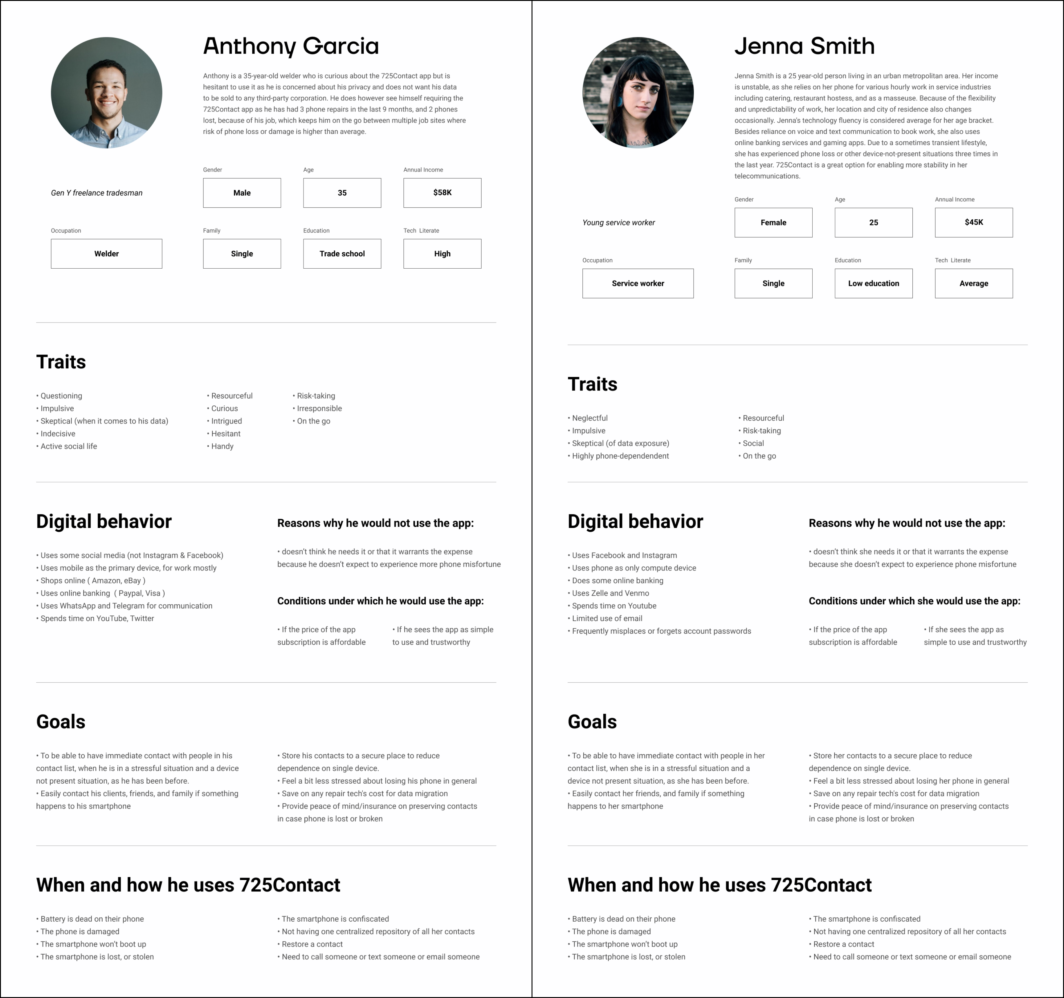
Since it has such a niche use, creating the personas for this project was quite interesting.
FOCUS 01
Research & Personas
We researched the competition, target users, and their requirements. After that, I've done several interviews and did a heuristic evaluation. Based on the results of primary research, I created user personas of potential users.
FOCUS 02
Visual Identity
The brand identity illustrates 725contact as a professional and
reliable company, trusted, and set on a course of offering a
solution to today's mobile reliance problem. As the idea of
725contact is new and futuristic in the way it approaches and
solves a problem the Art Direction has to represent that as
well.
The Brand Colors are chosen to represent the brand attributes
and nature. 725contact solves a problem for many people in
different instances, which is represented in various colors we
use in our Art Direction. The White & Black colors give the
brand a modern and premium feel and talk in line with the brand
promise, simplicity, and professionalism. As one of our
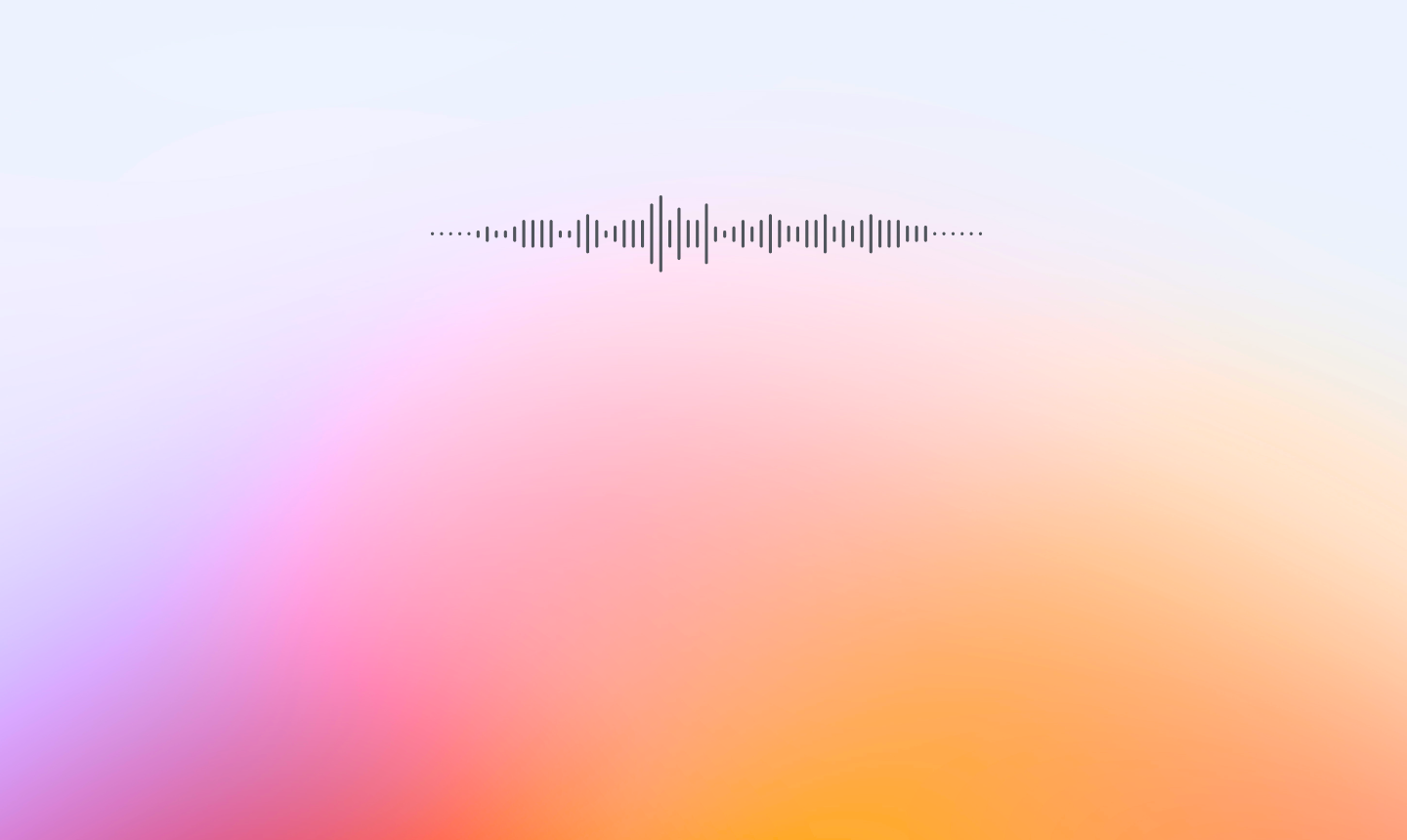
distinctive visuals, we use the Futuristic Pink Gradient. The
gradient of colors represents a mix of people and reasons why
they are contacting 725contact while keeping it friendly and
approachable.

The 725contact identity is defined by a simple and sharp typographic style and expression. The typographic principles are based on function, format, and purpose. They maintain a distinctive look and feel across all design forms. The sharp and clean typography creates a contrast and balance with the color gradients we use. The fonts we chose are technical, reliable, and secure in their look and feel but also in the way we use them.
FOCUS 03
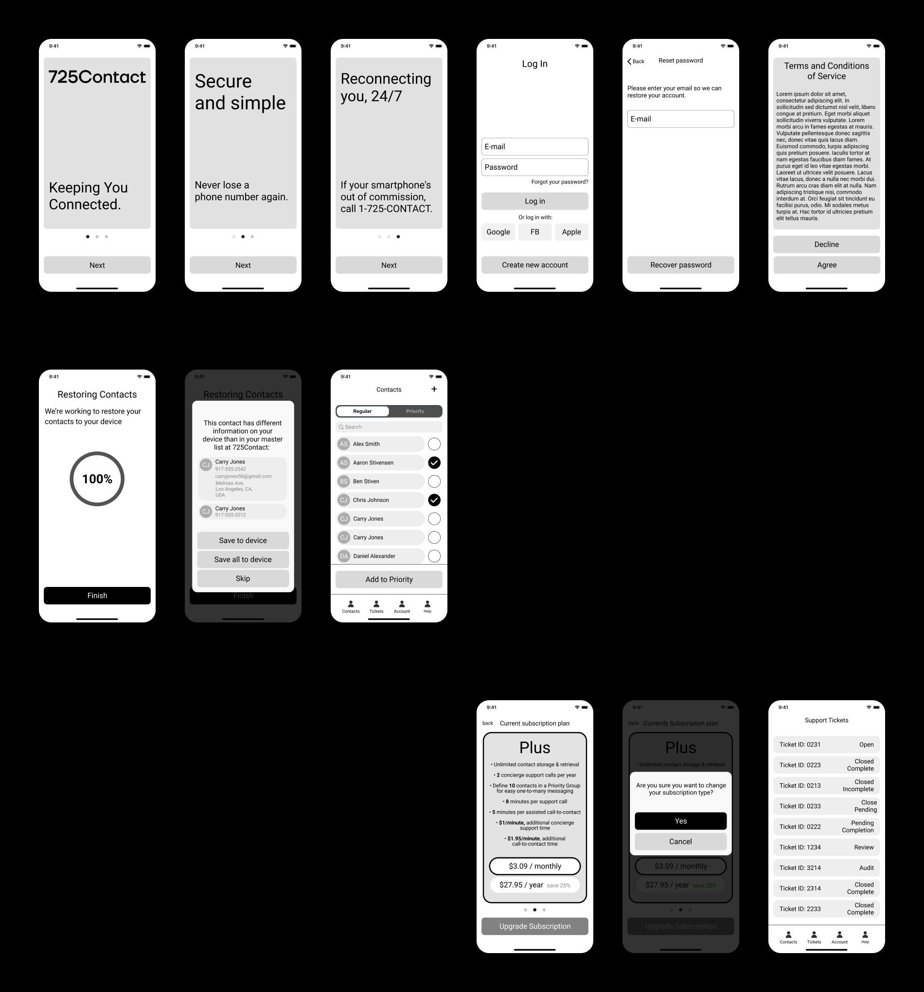
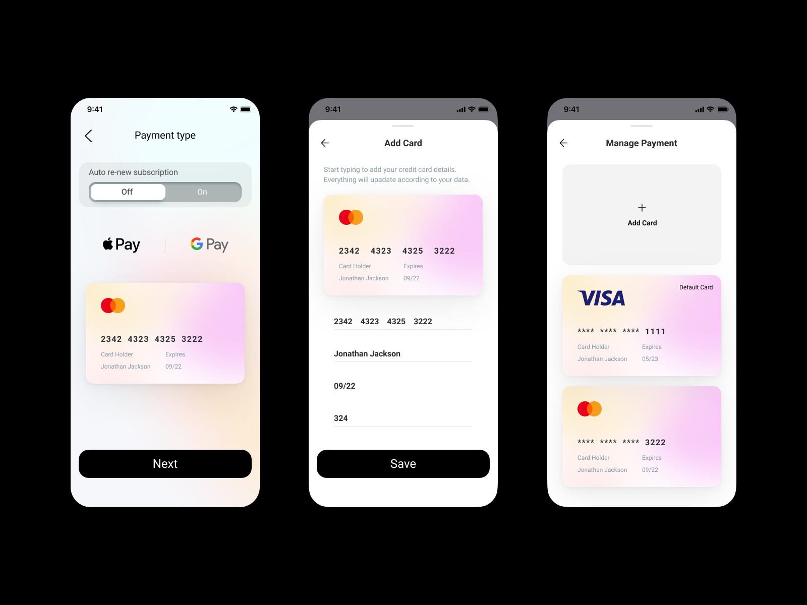
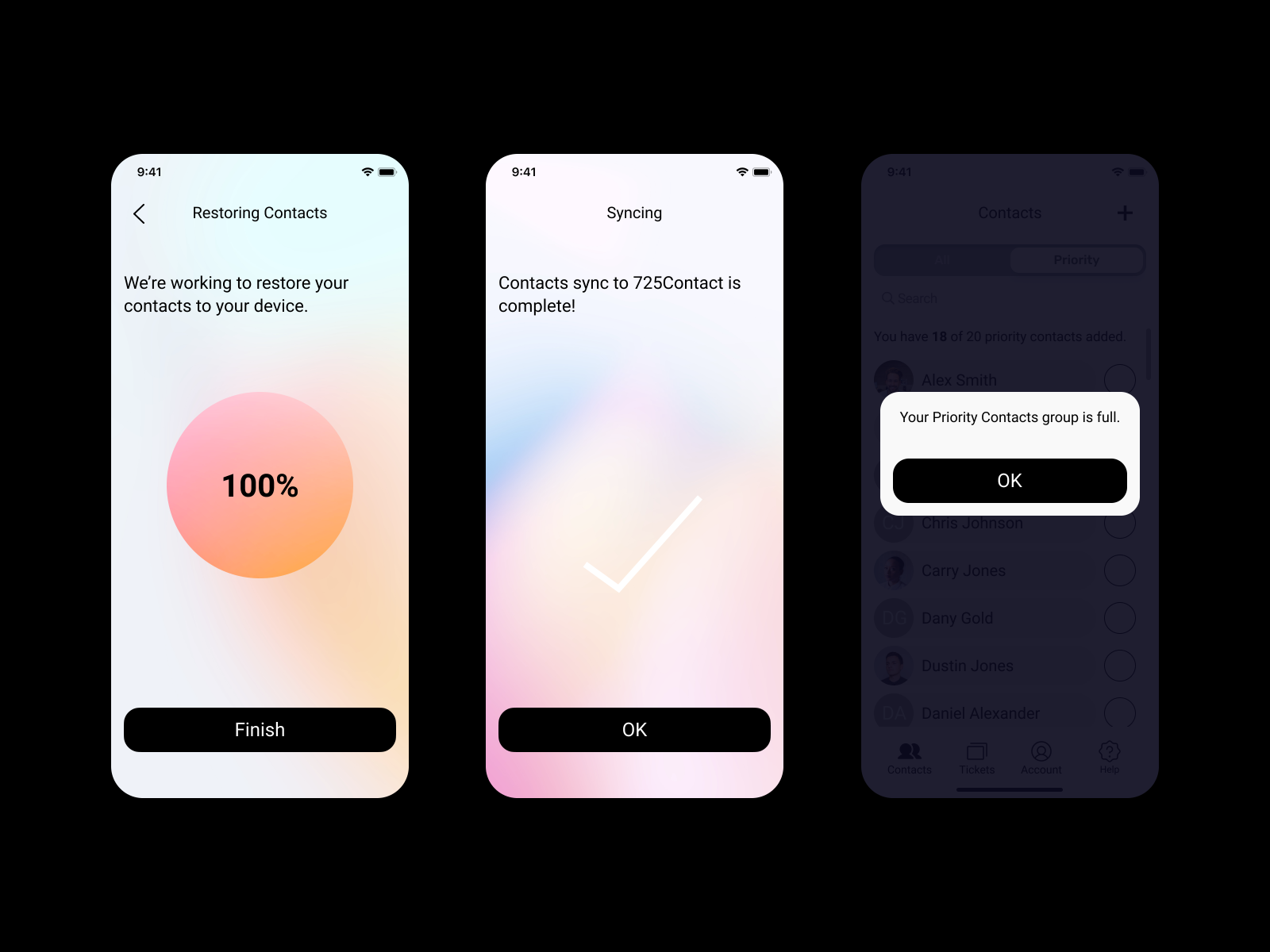
App Design
Based on the key findings and generated user flows, I came up with the following key app prototypes. It helped me arrange the interface elements easily and alongside I focused more on the functionality of the app. Moreover, the wireframes allow me to quickly test ideas without diving into the visual details.