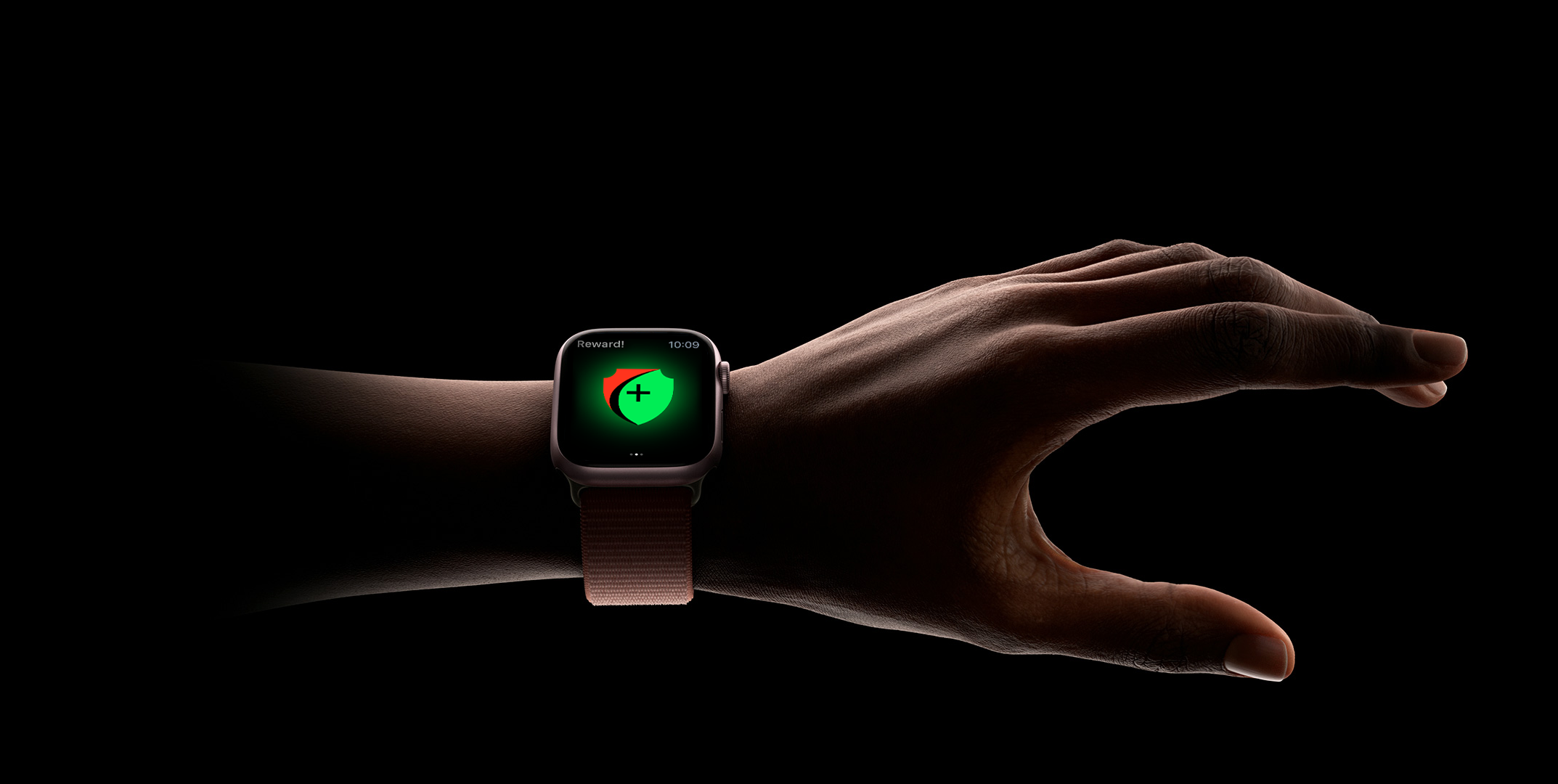

Sales Champ
A simple enterprise app that tells the employees their sale progress, sends them notifications, and keeps a record of their performance that is sent to the dashboard manager.
Client: MCShark
Role: UX/UI Design
Date: Jun. - Jul. 2019
As the largest Apple Premium Reseller in Austria, with more than
150 employees, it is important that every single employee can be
reached quickly and directly. It was crucial for MCShark that
their employees and motivated and trained in a engaging way
towards their goals.
Due to a NDA information on this project is limited.
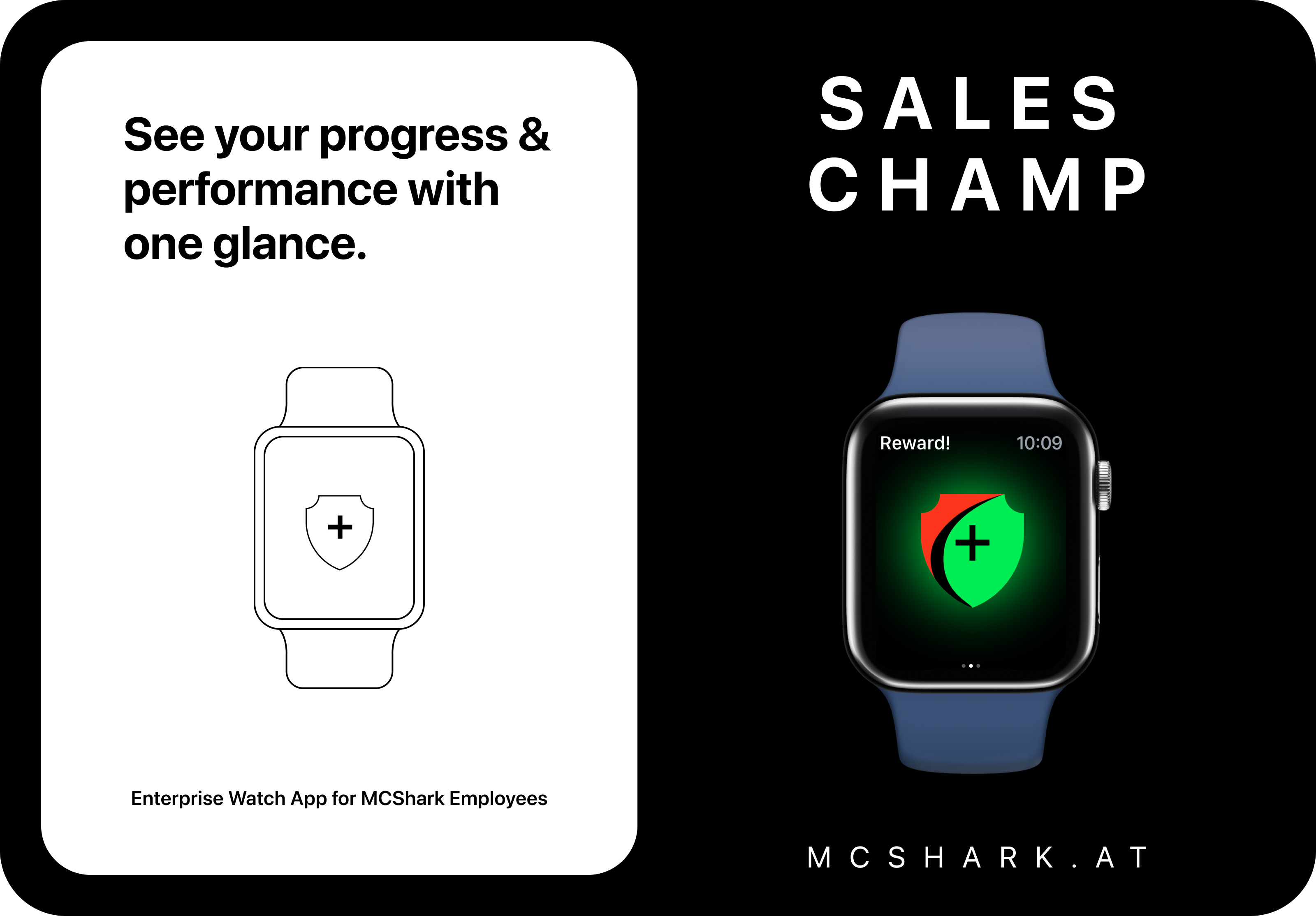
The most important features the project owner requested:
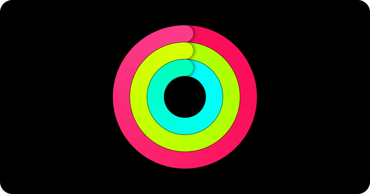
1. Users/employees should be able to see their sale progress in
a “ring” display such as on the “Fitness+” app
2. Users/employees should be able to have easy and fast access
to all screens with information besides the “ring” display
3. Users/employees should be able to see the data for each of
the four sales statistics (Mc Care+, Service Revenue, 3 PP
Revenue, and Total Revenue)
4. Design of simple notifications that deliver timely,
high-value information and enable important actions

Given that the app was meant to be an enterprise product, and a unique one at that, the app had no competitors. Instead, the product owner wanted me to focus on the “Fitness+” app for the Apple watch, as from day one they drew my attention to its design and usability.
The watchOS app experience differs from app experiences on other
platforms in two primary ways:
1. Apple Watch is designed to be worn, so the UI is attuned to
wearers and gives them an experience that’s lightweight,
responsive, and highly personal.
2. People frequently use a watchOS app’s related experiences —
such as complications, notifications, and Siri interactions —
more than they use the app itself.

Because the “users/employees should be able to have easy and
fast access to all screens with information besides the “ring”
display” feature was quite important, I opted for a vertical
type of “Page-based navigation”. I also wanted to bypass the
“parent-child item relationship” as it would have been an
additional step.
Page-based navigation is a way to present a flat
collection of information in which all items are peers. In
page-based navigation, each item is displayed on a single page.
People swipe horizontally to navigate from page to page, and
dots indicate their place in the set of pages.

For the user interface, I followed Apple's human interface
guidelines for watchOS.
Design Fundamentals I followed:
Target a single feature or task. When you keep your
experience tightly focused on an essential task, and display
only the most relevant and actionable information, you give
people the content they need every time they raise their wrist.
Enable quick interactions. Interactions with Apple Watch
are measured in seconds, so your app must quickly give people
the information they care about the most. Aim to present
critical items in quick, glanceable interfaces, such as
complications and notifications.

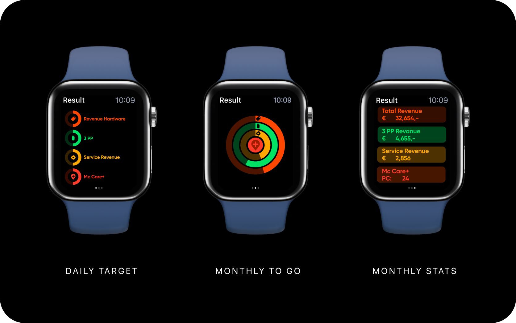
I had to be careful designing the user interface for such a small screen. Following Apple’s Human Interface Guidelines was crucial for me.
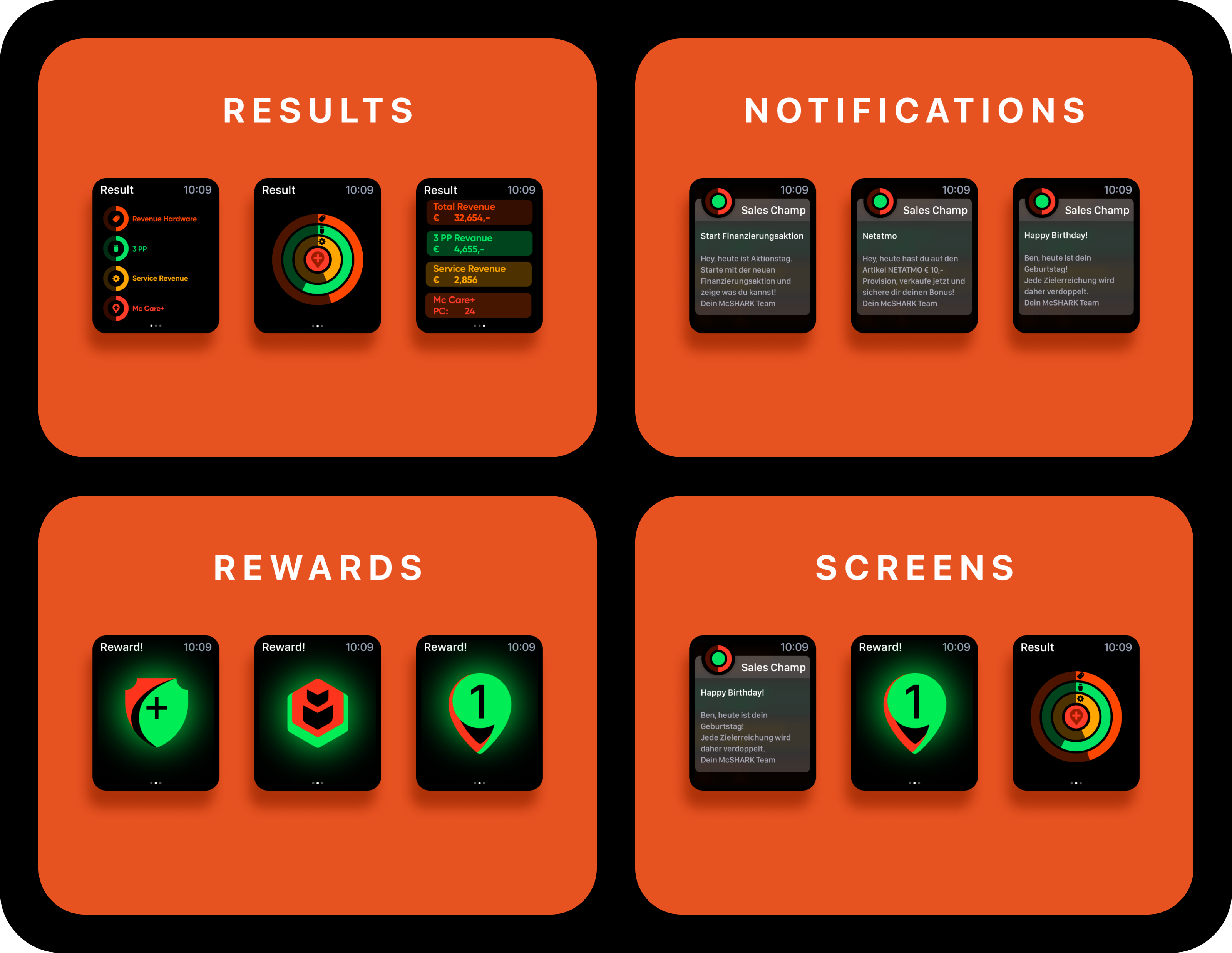
I did not include a launch screen.
Apple Watch interactions are brief and focused, and people
expect to view their content immediately.
I did not display the MCShark logo in the app. I found
the best use of screen space by displaying content instead of
nonfunctional branding elements.
I expressed the brand's identity through font, accent color,
and icon choices.
These elements and icons I used let me create a unique visual
style without making the app appear busy or complicated. The
colors were selected from MCSharks brand to better distill the
brands visual identity into the app.
I used a plain black background. I avoided filling
background areas with brand colors and applied colors to
specific elements instead. A solid black background reduces
visual noise and improves the legibility of text.
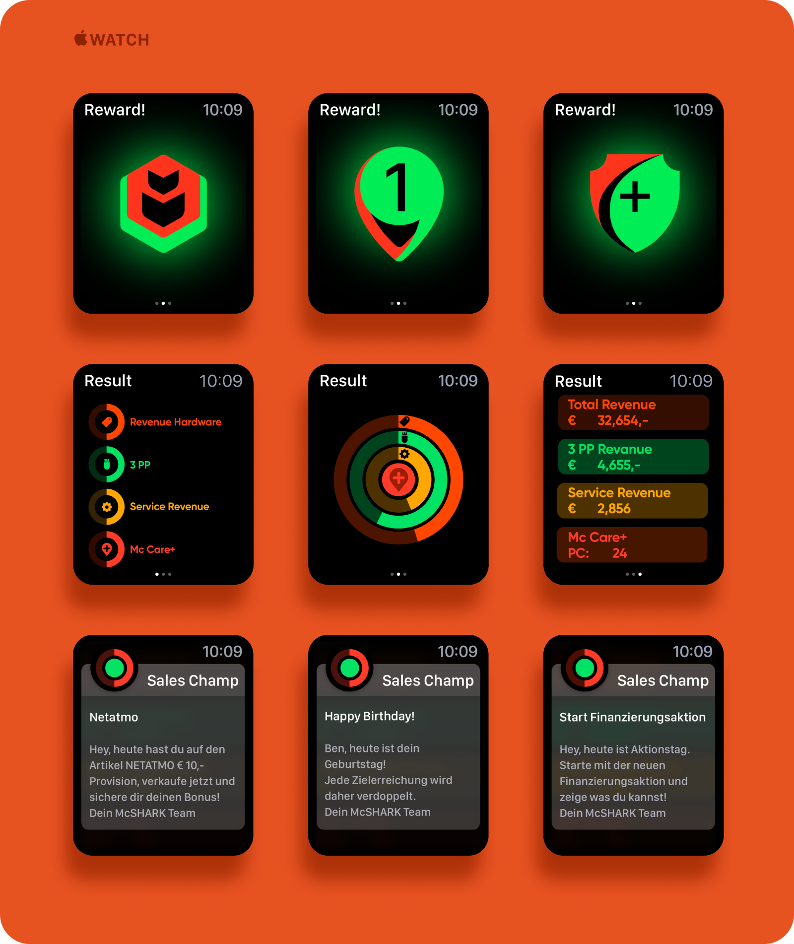
Information that used to be shared via Excel and mail (54% of employees did not read them), land directly on the wrist.
Daily goals are calculated in the background and sent to each employee as the "Close the Ring target" at the start of the day. No need for looking at an Excel table anymore.
Notifications are automated and distributed to all employees at the same time, or when pre-set for individuals.
Badges awarded for reaching their goals help keep the employee motivated and engaged.
Playfully, the employee is helped to achieve his goals and thereby supplement his salary.
Due to a NDA information on this project is limited.

