Huff Books
An E-commerce second-hand book store where people can buy and sell their books, only in Australia.
Client: Huff Books
Role: Branding, UX/UI Design, User
Testing
Date: Oct. - Dec. 2021
Overview
The idea behind the project is the creation of an E-commerce
website named HuffBooks, based in Australia. On the site you
would be able to buy and/or sell second-hand books, creating an
alternative market, which is eco-friendly and cheaper.
I had 6 weeks in total to conduct the Interviews, Competitor
research, and also finish the Personas, User Journeys, User
Flows, Sitemap & Flowchart. And another 8 weeks to create the
visual identity of the brand/product, and finish the UI design
for desktop and the mobile versions.
What problems does this product solve?
Depending on the two types of users, it solves two problems.
1. The problem of a customer who is having difficulty
finding the books they are looking for.
2. Making it easier
for sellers to find buyers for their specific used books.
It solves also the problem of cost and convenience:
• Helps people access secondhand books.
• Helps people look up books easily online.
• Solves the problem of reprinting books that have already been
printed.
FOCUS 01
Research
All of the information we gathered was drawn from research
findings, articles, interviews, and public statistics on book
readers in Australia.
We conducted a survey on Pollfish where we asked important
questions to streamline into data that we could use to guide our
decisions. The number of participants was 600, all of whom were
based in Australia.
The Survey
A great source of info that was provided by the stakeholders was
the:
Australian Book Readers: Survey Method and Results
Other sources:
1. Marketing Week
2. Wired
Listed below, are the findings I outlined from the overall
research.
Target Audience:
Buyers: They are mostly female, single, or married without kids
(20 - 35). Recreational readers or collectors. Escapism &
self-improvement books are the main reason they wanna read.
Sellers (a): They own a large books store and wanna scale their
business online.
Sellers (b): People with less than 30 books and they wanna get
rid of some of their used books.
Most of them are used to shopping online for second-hand
books on eBay, Amazon, Gumtree, etc. Not often but they have
experienced issues in the past that prevented them from buying
a specific book.
The Pollfich survey data showed that among the “other” careers
people in Educations & Health Care were among the largest
public. With most of them being employed for wages with a
finished University.
Their frustrations are: time-consuming to upload the book,
knowing the price of what to price their books. Some books are
out of print, and they exist only in the secondhand form (huff
books will offer those books). They don’t like consuming and
want to recycle. Worried about leaving a smaller carbon
footprint.
Other pros of using Huff Books: Encourages buying locally.
Cheaper post and shipping (at cost). Meeting up with somebody in
person when the store would be closed (on a Sunday for example).
Target Audience - Age group:
Buyers: 20-35
Sellers (a): 35-65
Sellers (b): 20-40
FOCUS 02
Goals & Personas
In a detailed interview with the client/stakeholder, we figured
out and determined the main goals of the product. For them, it
was most important that the site be easy to use and navigate.
Must-have elements:
• Easy Login
• Searchbar
• Categories
• Top books on the home page
• Share capability on social media
• A page dedicated to university textbooks
• Like to have: Donate button for charities.
Personas
For HuffBooks I made two user personas, one representing those
who will use the website for buying books, and one for those who
will use it for selling.
The end results were also drawn from the average demographics
and psychographics of the product’s typical users. For this, I
used the data which was collected via an online survey and some
extra research that I did on the tendencies of Australian book
readers.
Based on the user personas, I identified the main user needs we
wanted to address in the website while also taking into
consideration the goals of Huff Books.
1.
Product search to easily find products
to easily find products
2.
Clear product organization for a
seamless shopping/selling experience
3.
Helpful Product Suggestions that
reflects Huff Books expertise and curated inventory
4.
Detailed product information to
ensure proper product selection
5. Reviews to help make informed
buying decisions and allow for user input
6. Efficient checkout process to
save users time and allow for easy purchase of products
7.
Customer brand relationship to
establish trust

FOCUS 03
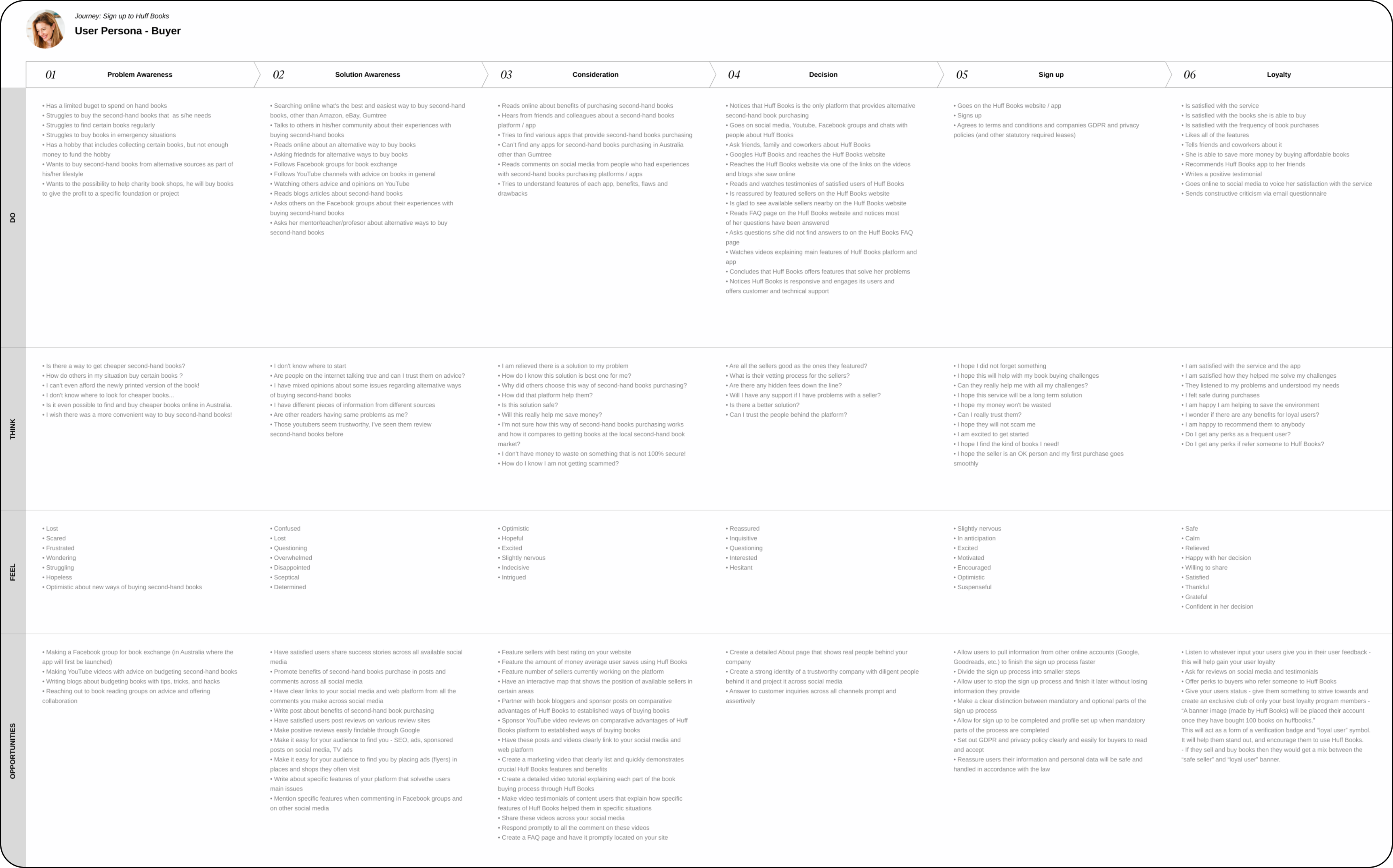
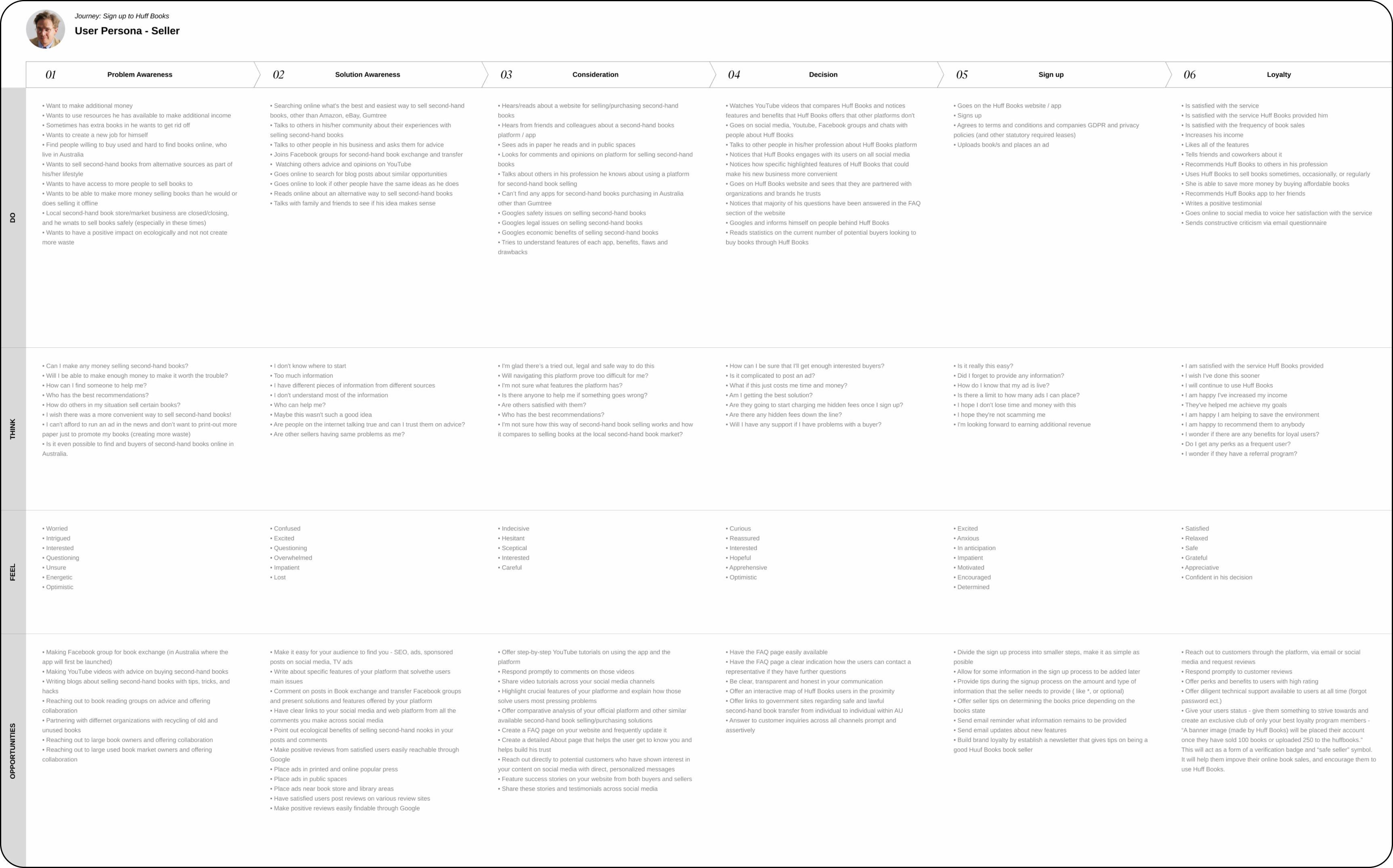
User Journeys
Mapping out the user journey helped me define the customer
experience from start to end.
I find user journeys immensely important as they define the
motivations for using the product, the problems that the product
solves for the user, the different phases of the product, and
they define the experience from start to finish, as well as
emotions and feelings that the user may have along the way.
FOCUS 04
Competitor research & analysis
Interestingly enough Huff Books was somewhat unique on the
market, in it that it was a combination of online second-hand
stores and online book stores.
To gain inspiration for the Huff Books website, I began by
identifying 3 main competitors, specifically online second-hand
goods and book stores in Australia, and 3 main indirect
competitors in the online book market. The direct competitors I
analyzed were Booktopia, Gumtree, and Brotherhood Books.
The indirect competitors were Book Depository, Amazon, and eBay.
My goal was to compare and identify common features across these
sites and potential opportunities for Huff Books to
differentiate itself.
Top cometitors:
• Book Depository
• Booktopia
• Gumtree
• Brotherhood Books
Let’s discuss the biggest competitor and inspiration behind the
user experience and interface of the website — Book
Depository.
From day 1. we knew that Book Depository was the closest to what
the client had in mind in terms of navigation and usability. And
it is easy to see Books Depositories influence our choices.
Their overall layout is clean, intuitive, and simple. Their
large user base, a clear indicator of a product that works well.
And Australia has the most book purchases via Book Depository of
all the countries in the world.
Aussies sure do love their books, but no doubt that the “free
shipping” was a crucial feature that led to Book Depository's
success in Australia. Free shipping is not an option that could
have been implemented in Huff Books, but we did add a “No
shipping button” for all of the users that were interested in
buying their books locally, in their town, where they can meet
the seller face-to-face.
I used “similarweb” for more statistics, but also to see their
presence on social media, and audience interests. This is also
something I later thought about when creating the User Journeys.
Statistics about Book Depository on similarweb:
After conducting more research I created a table with the most
important features Huff Books would need and compared the
features to the ones of our main competitors. It was used to
show the stakeholder and project manager all of the features we
would need to implement in order to meet the
stakeholders/project owners' requests.
The most important takeaway from this activity was learning
how different websites organized their products/books, their
features, and the overall layouts they used for those
websites.

FOCUS 05
Product structure
With the results of the personas, user journeys and competitor research, I created a sitemap that defines the overall structure of the website. This ensured that the website would be more intuitive, and that the products were placed exactly where users would excpect to find them.

FOCUS 06
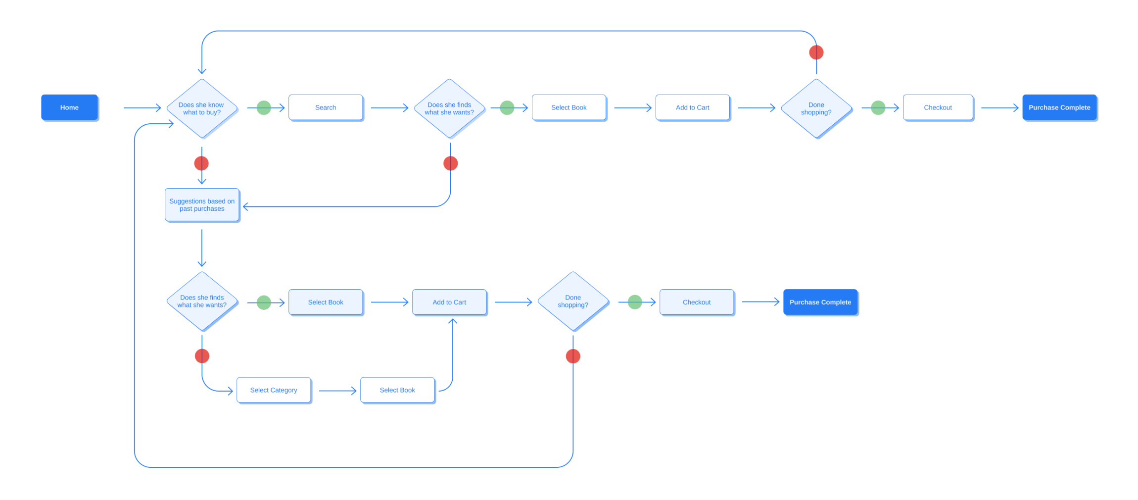
User Flow
The point of this was to define the intended steps each user
might take through various pages and actions on the website in
order to complete their goal. Not only would this allow me to
focus on what each of the users needed to accomplish, but also
how to deliver that experience in the most effective manner
possible when designing the website.
Over the period of the next two weeks, I redefined the User Flow
a couple of times to make sure that the users can go from
browsing books they are looking for to having them shipped to
their address. I created a general User Flow that was always
there for the stakeholders, project manager, and developers to
check.
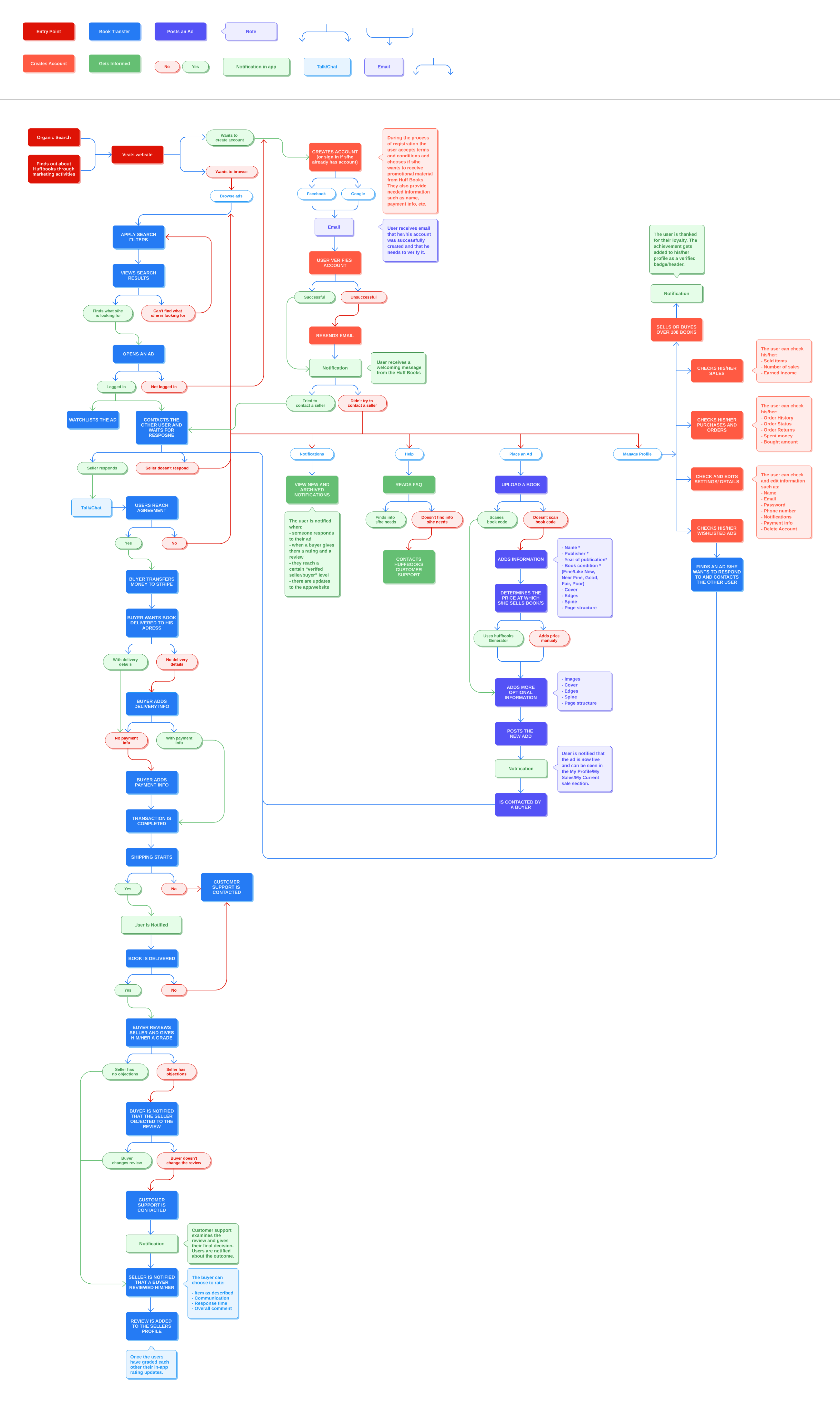
And lastly, I made a simple isolated flow for the shopping experience because of its importance to the overall functionality of the website.
FOCUS 07
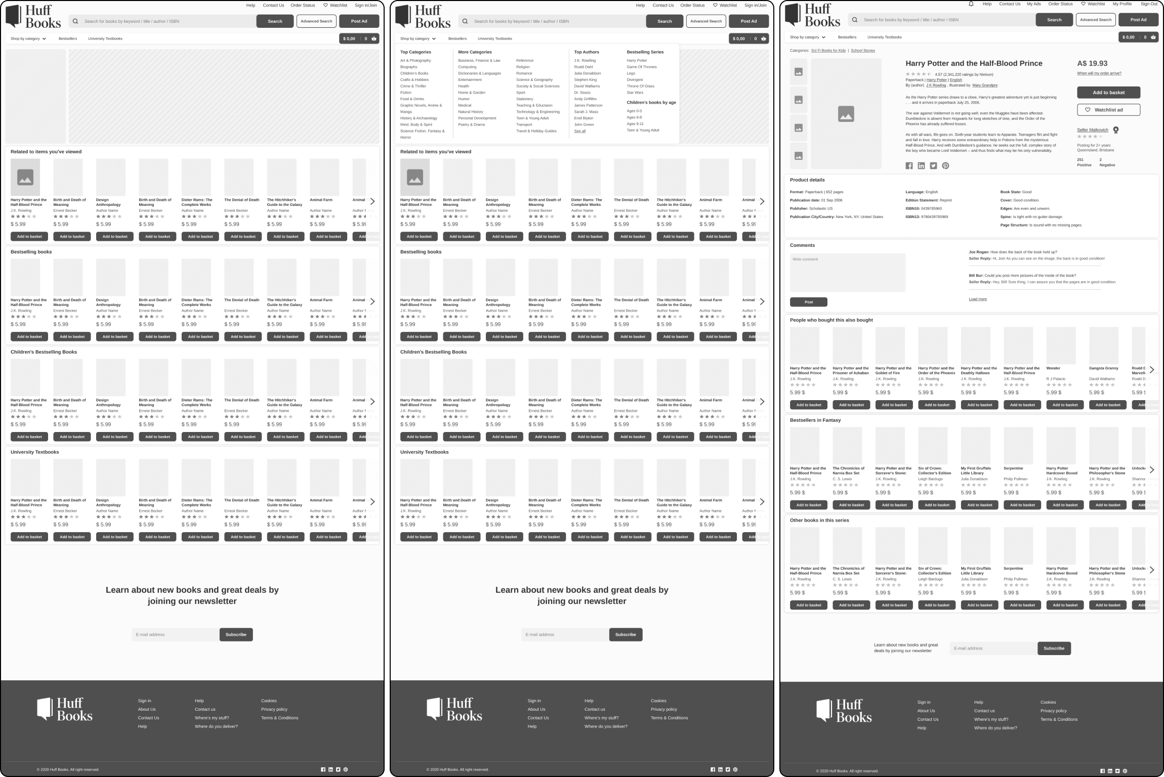
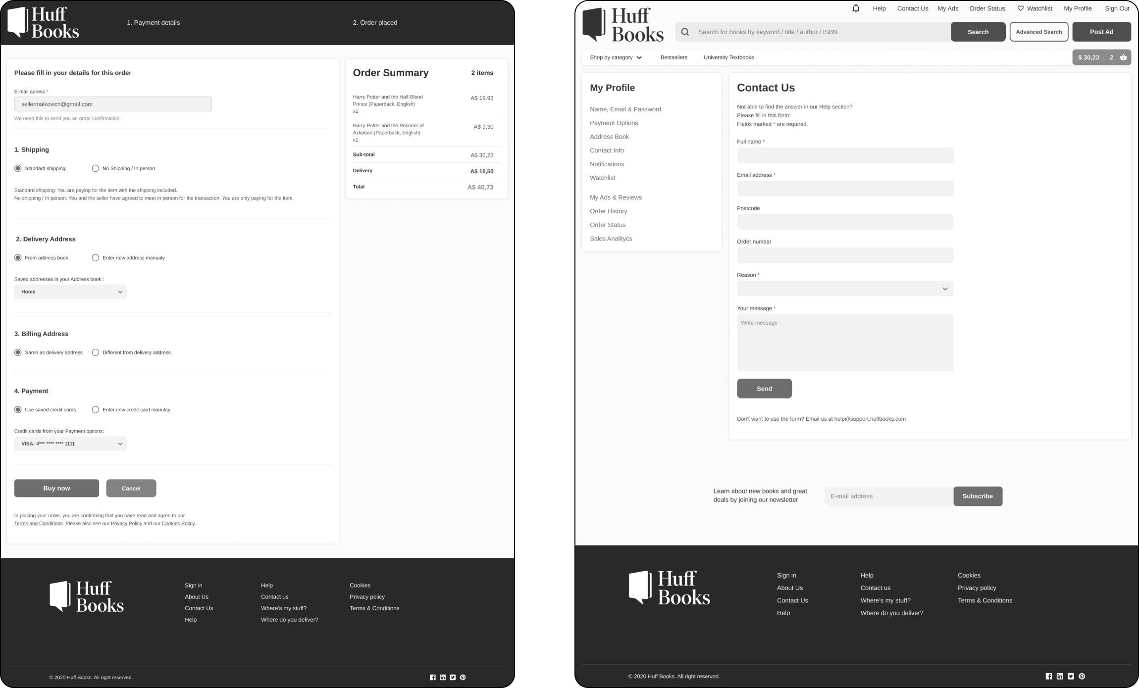
Wireframes
A crucial step before building the actual product was the wireframes, where I could test out ideas and see how they function in reality. For HuffBooks, I started making high-fidelity wireframes right away, as we already had enough information about how the website should be organized and function.
FOCUS 08
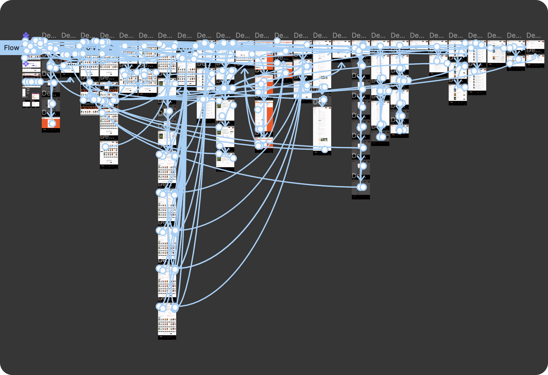
Prototyping & Testing
Before development started I wanted to test out the website and
see if potential users would have trouble navigating it.
I recruited 7 participants from the Slack community to conduct
remote moderated usability testing on my designs.
During the test, I asked them to complete a series of tasks that
helped me understand their thought process and see if they could
accomplish the set goals. This was also the perfect time to ask
about their likes and dislikes of the prototype.
A great thing about the tool I used (Figma) was how simple
linking the screens was when I used components. Altho I’m not
gonna lie, it was a tedious process, but an important one for
this stage.
Almost everything had to be clickable to get a sense of a real
product with good navigation. This led to a lot of linking of
buttons, which resulted in... well this...
Objectives of testing:
• Find issues in the navigation & validate the flow
The scenario tasks:
• Navigate a specific book (which we told them)
• Purchase a book (from selecting it to the checkout)
• Post a review
Questions we want to be answered:
• What was the ease of use in each of the tasks (1-7 score)
• What were the critical points in each of the tasks?
The Moderating techniques we used:
• Concurrent think aloud
• Retrospective probing
Participants info:
• Gender: Male & Female
• Age: 23 - 29
• Tech Literacy: High
Software:
• Figma, Google forms
Retrospective probing
I would ask my participants to undertake a scenario test where I
provided access to the prototype and the following scenario:
"You are a new user who wants to find a specific book and
purchase it, after which you will post a review."
The participants then had to navigate the prototype to find the
product and continue with the other 2 steps. I kindly requested
each user to verbalize their thoughts while using the prototype
so I could note down what they were thinking. I was pleased that
all 7 participants navigated the website quickly and easily.
The 7 participants involved in the testing thankfully had no
issues navigating the website (Note: they have used Book
Depository and eBay before, which was ok with us as most of Huff
Books potential users are familiar with those websites).
For the sellers, however, we did not test the “Posting an Ad”
flow as it required two steps and the stakeholder felt that it
was not necessary at this point.
FOCUS 09
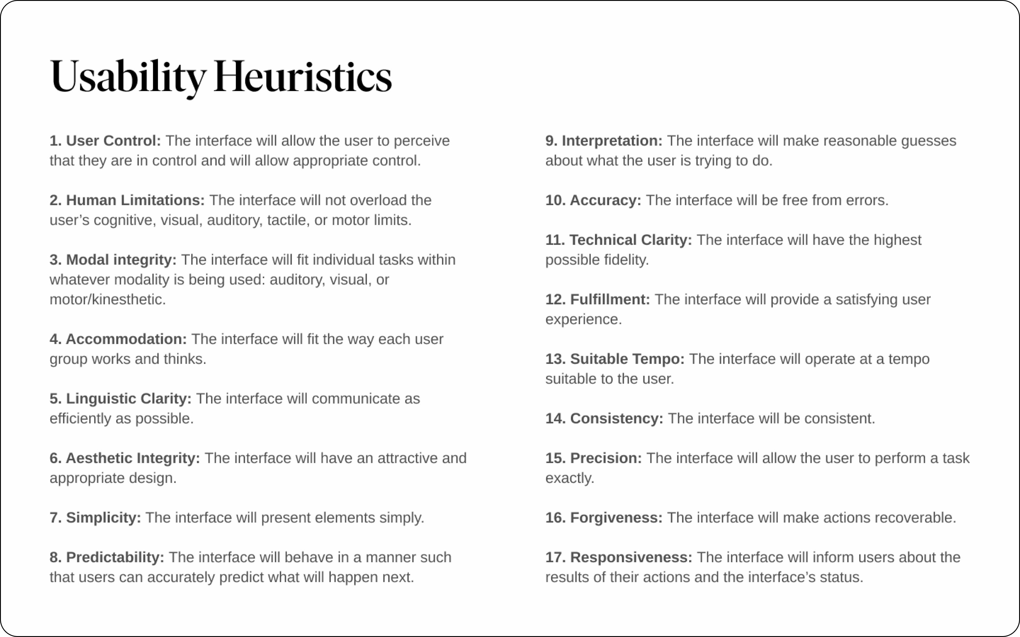
Usability Heuristics
Scope: I set to examine only the most crucial areas of the site
and focused on specific user flows and functionalities, such as
login/register, search and browse, product detail page, shopping
cart, and checkout.
I considered using “Jakob Nielsen’s 10 Usability Heuristics for
User Interface Design” but the “20 Usability Heuristics by
Weinschenk and Barker” was the list I opted to check against. I
did however remove 3 items from the list as I did not see them
necessary for this project.
I was the only designer on the project, and altho I did uncover
several usability issues during a heuristic analysis, I wish
there were more experts present in the analysis.
For any issues that I found I left comments (in Figma) on those
elements and later on I made sure that the problems did not
further violate any usability heuristics.
Note: I combined heuristic analysis with one-on-one user
testing.
FOCUS 10
Visual Identity
I conducted another set of interviews with the stakeholders to
better understand the brand's attributes, look and feel.
We agreed that the visuals had to be clean, classic,
trustworthy, inviting, elegant, and have a different and bold
color to distinguish them from their competitors.
The color orange I chose was risky as it is either liked or not
by the majority of people. But in the end, we opted for it
anyway, as it was warm, different, and memorable.
The beautiful and refined serif typography I chose is “Ivar
Display”.

![]()
FOCUS 11
User Interface Design
In the final step, I duplicated the high-fidelity wireframes and
began giving them a makeover. That is, applying the visual
identity that we defined.
I decided to get rid of all unnecessary colors and just keep it
simple and clean for the best navigating experience. Besides,
there will be many books in different colors on the website.
The orange color is used rarely and when it is, it's usually
there to lead our customers through the whole purchasing
process.
Besides orange, I used black for most of the buttons to draw
just the right amount of attention. The website is mostly white
so the use of black doesn't make it morbid or too edgy.
When using it with an elegant font such as Ivar Display Medium,
we get a classy and sophisticated feel to the interface.
In contrast to all of that, I've added a corner radius to almost
all elements. The softness of the edges helps to keep the
website smooth and soft, implying its ease of use, and the
clickability of the items (buttons, books, etc.).
The corners also blend in nicely with the background. We can
still see the sections clearly, but they are not drawing
attention from the content.
Using the authors as faces of Huff Books
To beak the sterile look of the home page I added the best-selling authors in one line, as it was convenient, interesting, and acted as a quick “filter” to their books, which statistics say are the most searched for.
Conclusion
The end product remained loyal to all the primary goals that we
had set up from the beginning, focusing on overall usability and
ease of use.
This project challenged me and so helped me grow and learn, in
its particular ways, as every new project does. In the end, I am
grateful for all the steps and how they all transpired as I’ve
honed my UX skills immensely during the design process.
Thank you for reading!