
MEPIC
MEPIC is a mobile and web application which enables sports fans to collect, exchange game highlights, and compete in a fantasy game using their highlights.
Client: GamePulz
Role: Creative Director & Product Designer
Date:
Jun. - Jul. 2022
MEPIC is a mobile application enabling sports fans to:
• Collect and exchange game highlights
• Compete in a fantasy game using their highlights
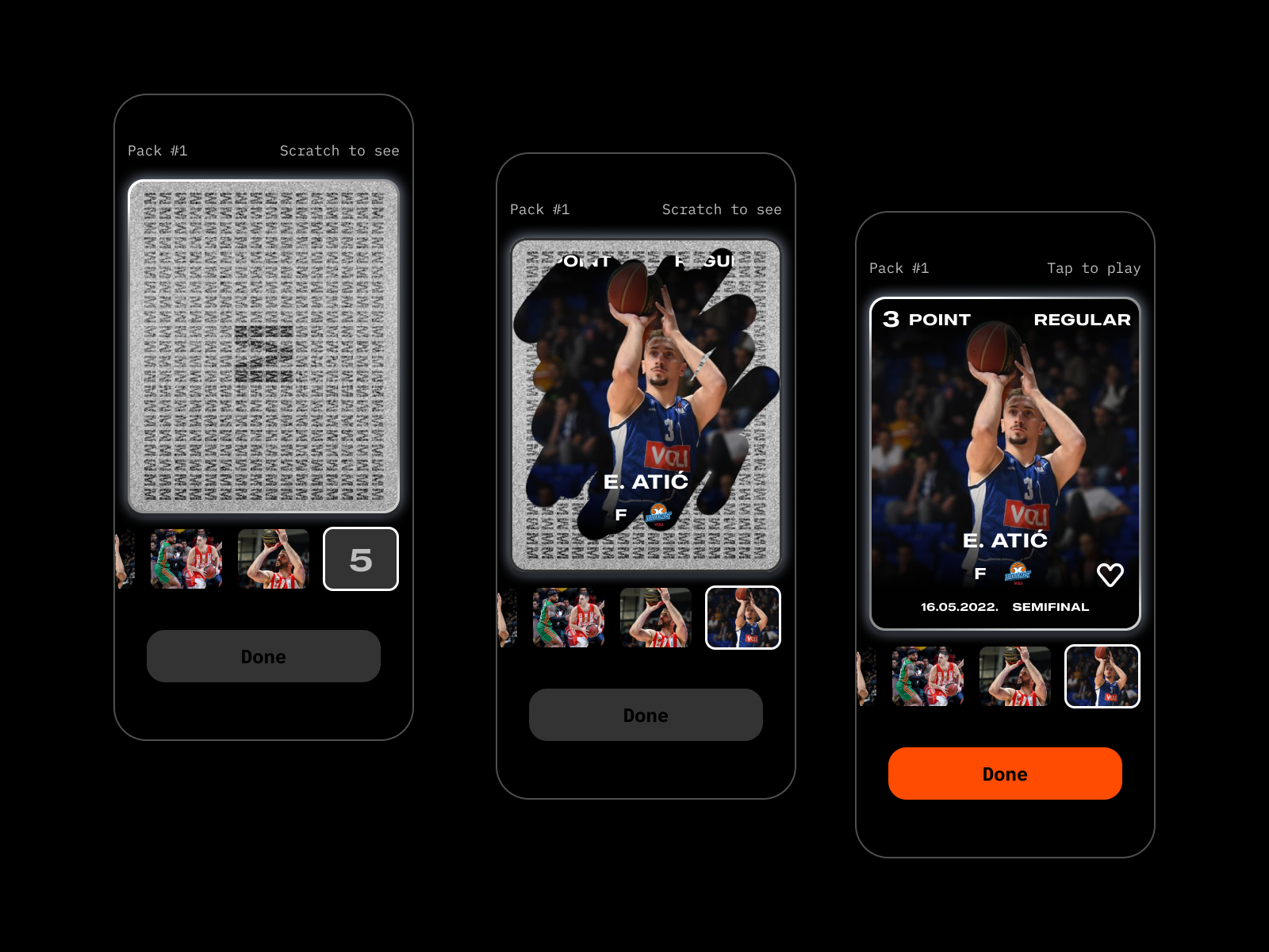
Every week each user receives 5 random highlights hidden in the
form of scratch-off cards. When a user scratches the card with
their fingers, the highlight is revealed, and the user can now
watch a video.
I was assigned the following tasks:
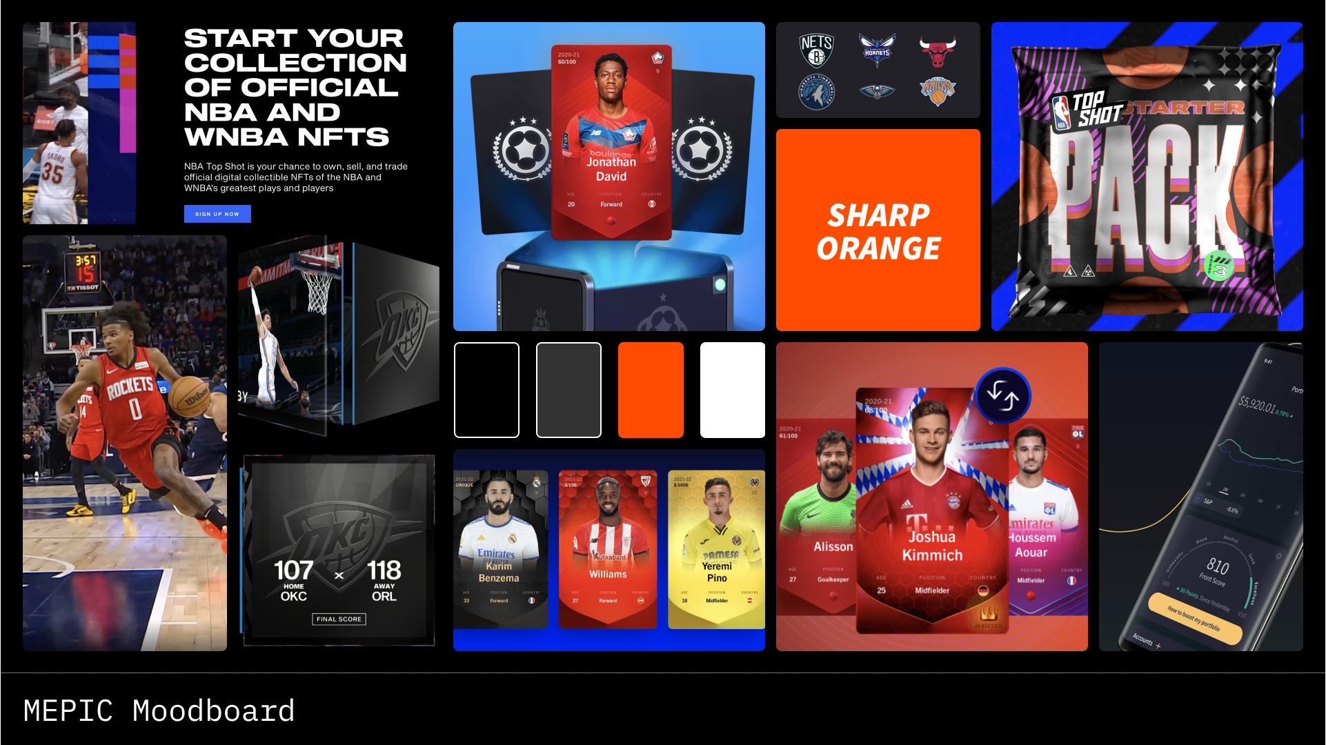
1. Propose and deliver a Visual Idenitity (color scheme, type,
etc. based on given moodboard)
2. Propose and deliver complete wireframes
3. Design collectible items (the pack and cards/shots)
4. Design high-fidelity mockups
5. Create a clickable prototype
In a detailed interview with the client, we figured out and
determined the main goals of the product. For them, it was most
important that the app be easy to use and navigate, but at the
same time be "different" and gamified.
The most important features the project owner requested:
• The collectible item should be designed in a way that gives
you the look and feel of a physical collectible while using the
advantages of a digital format.
• As a user, I want to set my username and choose my favorite
team, so that other users will know who I am cheering for.
• As a user, I want to discover in a fun and interactive way,
which new collectibles I have received,so that I am entertained.
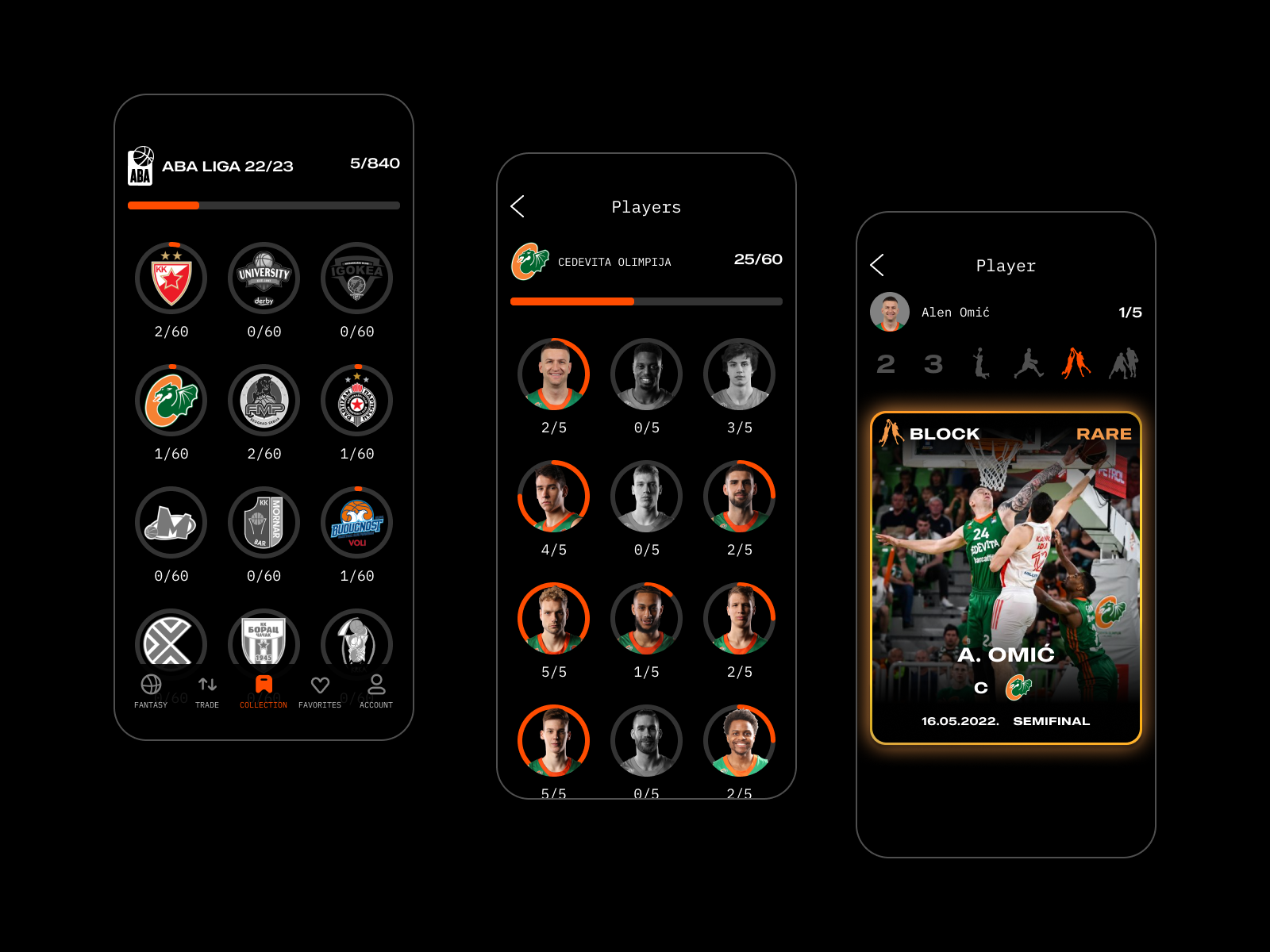
• As a user, I want to see how many collectibles I have, so that
I know how many are left to collect, and have the ability to
filter them, so that I can watch my favorites.
• As a user, I want to navigate my collectibles on league, team,
and player levels, so that I can keep track of which ones I have
and which I am missing.
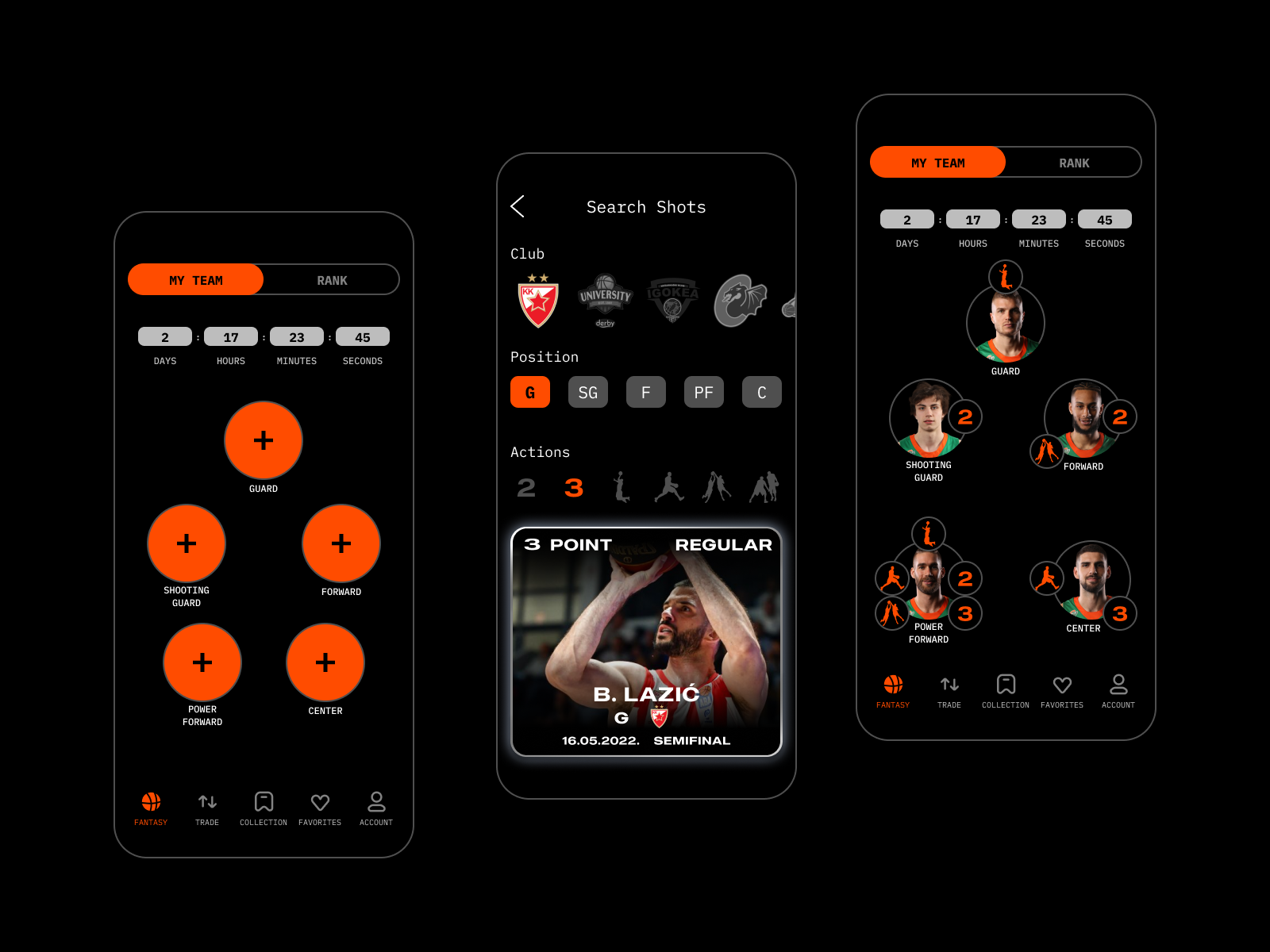
• As a user, I want to choose which players will be on my
fantasy team so that I can compete for prizes.
• As a user, I want to see standings and results of winners, so
that I know how I rank and who is the best.
Personas
The personas were drawn from the average demographics and
psychographics of the product’s typical users. For this, I used
the data which was collected via surveys and some extra research
that we did on the tendencies of users of similar projects.
Based on the user personas, I identified the main user needs we
wanted to address in the app while also taking into
consideration the goals of MEPIC. The app users we would end up
designing for would be 98% young men with high-tech literacy.

The point of this was to define the flow and screens we would be designing for the first version of the application. Not only would this allow me to focus on what each of the users needed to accomplish, but also how to deliver that experience in the most effective manner possible when designing the app. It was also a fast way to plan the information architecture and ensure that developers and clients get a clear understanding of the project structure.


I conducted another set of interviews with the stakeholders to
better understand the brand's attributes, look and feel.
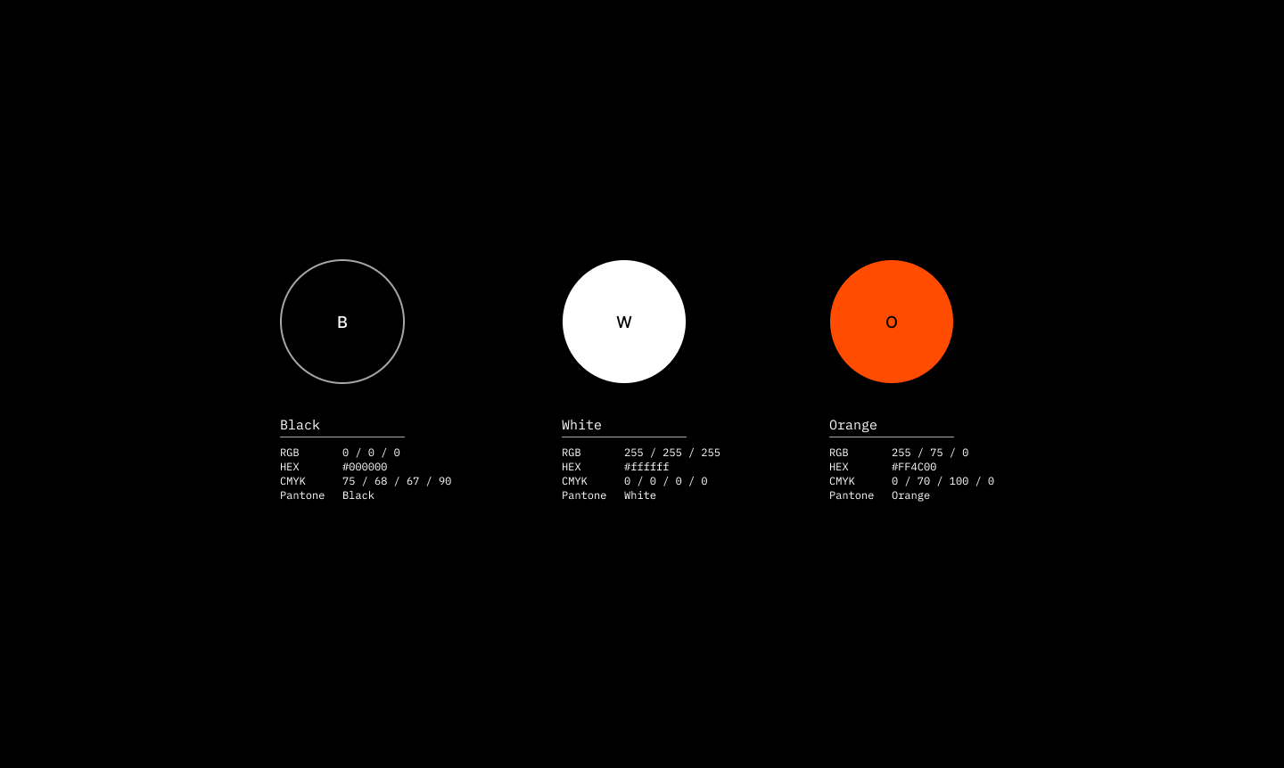
We agreed that the visuals had to be clean, bold, technical,
dynamic, and have a different and bold color to distinguish them
from their competitors.
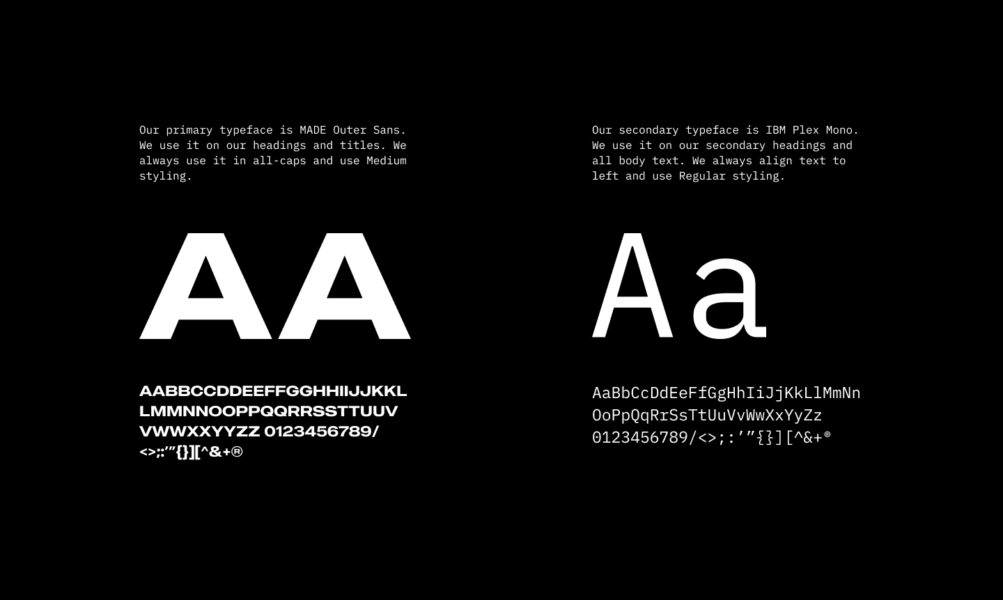
The "large and bold" typography I chose for the logotype and
headers was “MADE Outer Sans". The body font was "IBM Plex Mono"
as it was cold, technical and created a good balance to the
strong geometrical header font.
The badges were also designed in a style setting harmonic visual
combination with other graphics. They had to follow the sporty &
cool vibe throughout the app.


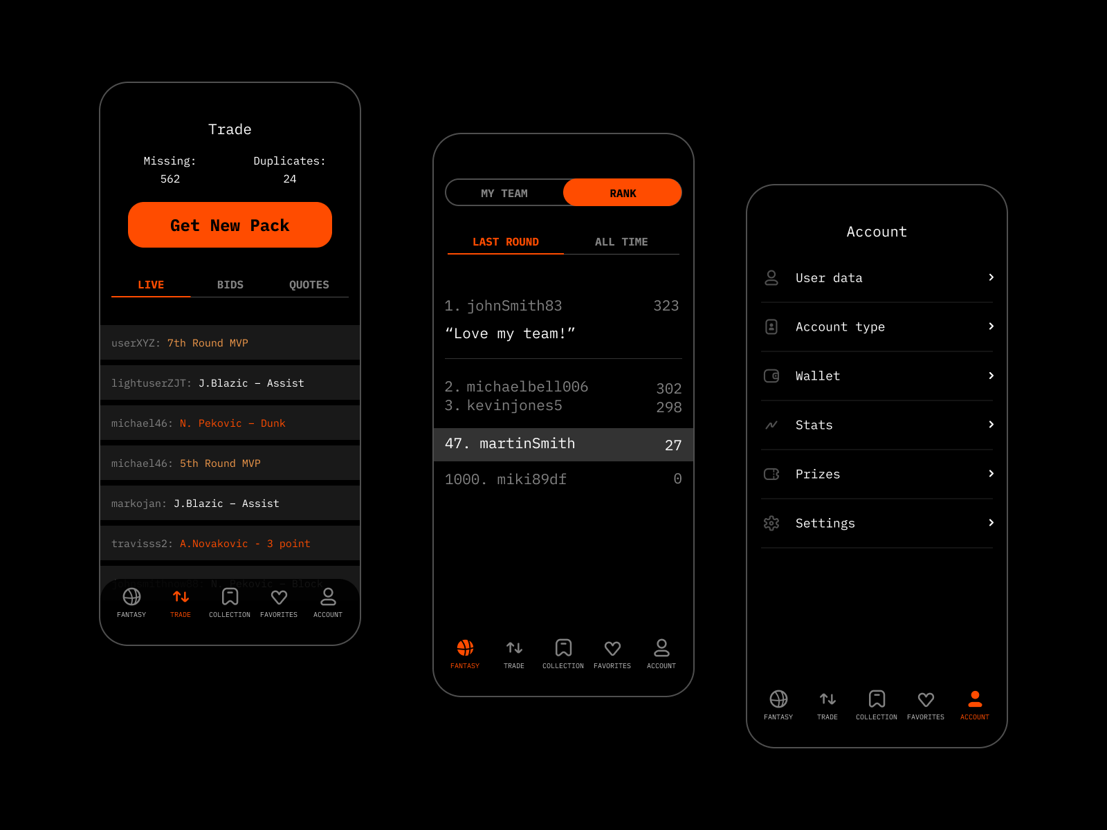
The app design included the comprehensive and diverse
functionality which had to be presented to users in a simple and
clear way. We had to analyze and prioritize all the points, as
there was a high risk of overloading the screen. By research and
testing, the user scenarios were created to determine which
information about the shots in the game were found the most
important.
The application layout is structured around intuitive
navigation, dark background, and eye-catching visuals. The dark
and neat background sets the effective space for a variety of
videos and graphics that need to be seen as the video shots were
the primary point of the app. Clear and solid typography based
on san-serif fonts makes the information scannable and legible
on screens of different sizes. Color contrast is used for
amplifying quick navigation: bright color accents attract users’
attention to interactive zones and functional states of the
layout elements.
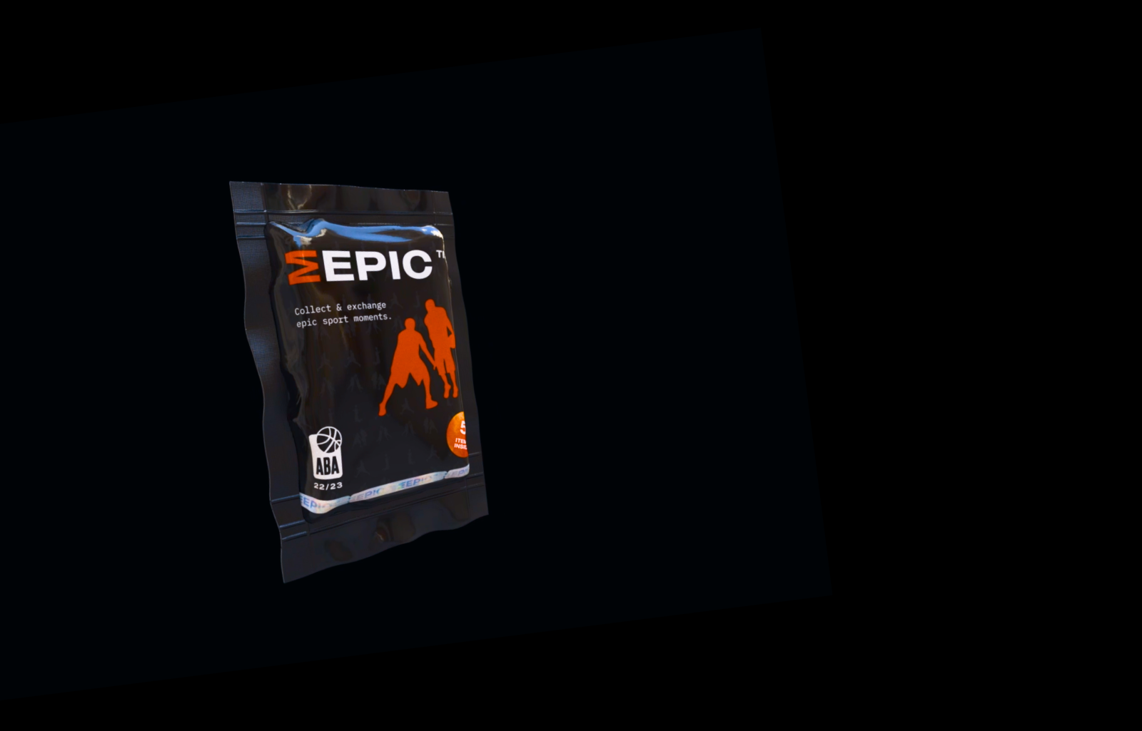
It was important for the client that the potential users have an
"as close to real-life experience" in opening their shots pack
(collectibles). So I ended up designing a 3D pack with the help
of a 3D artist so that it represented a "real" product that can
be purchased. The cards themselves were meant to be scratch-off
cards so the whole experience was more immersive and
"real-life-ish".

![]()