
Rezieo
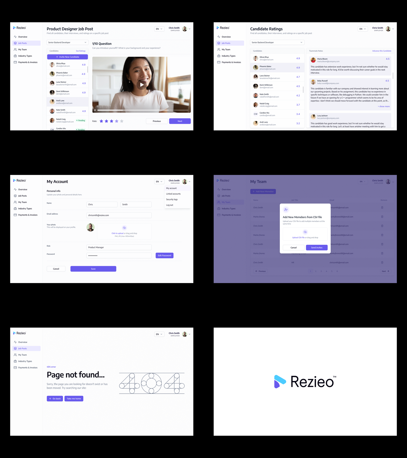
Describing the functionality of the app in general terms, Rezieo™ is a SAAS web application for On-Demand Video Interviews.
Client: Rezieo
Role: Product Designer
Date: Apr. - Jun.
2022
Simply send a link to a promising candidate and the Rezieo app does the rest. Invite team members to view and rate candidate's recorded interview video. Then see quickly who will be a good fit for the position and your people. Simple, Affordable, and One Flat Rate.
The application has a lot of functionalities and steps,
therefore, the user interface for this sort of product needs to
support the high level of visibility for changes, intuitive
navigation, and presentation of big data bulks with a high level
of readability and visual marking of key details.
The basic objective was to design a platform that will be easy
to use, informative, supporting broad functionalities for HR and
management professionals.
I was part of a team working on this project, consisting of
developers, a PO, and a Creative Director.

At the UX design stage I worked over layout and navigation
design solutions concerning three issues:
• A way to simplify the "Job Posting" process (as one single
step included so many fields and options we had to split the
process into 4 steps)
• A way for the person uploading the Job post to see on which
steps he is currently on
• Simplify the "Candidate Interview" process

A thorough analysis of the target audience and the unique selling points of the product allowed paying attention to the practical aspects of the product’s functionality.
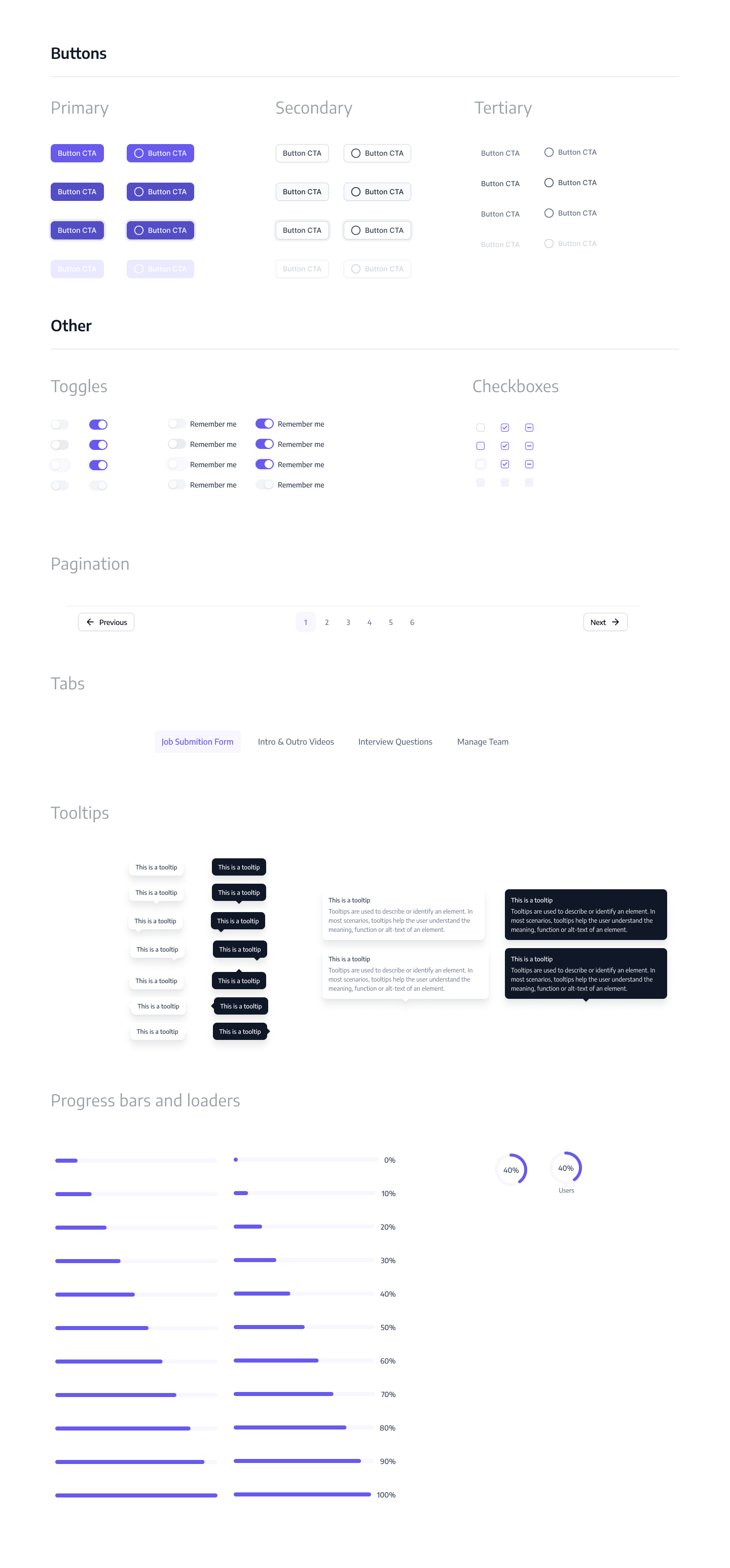
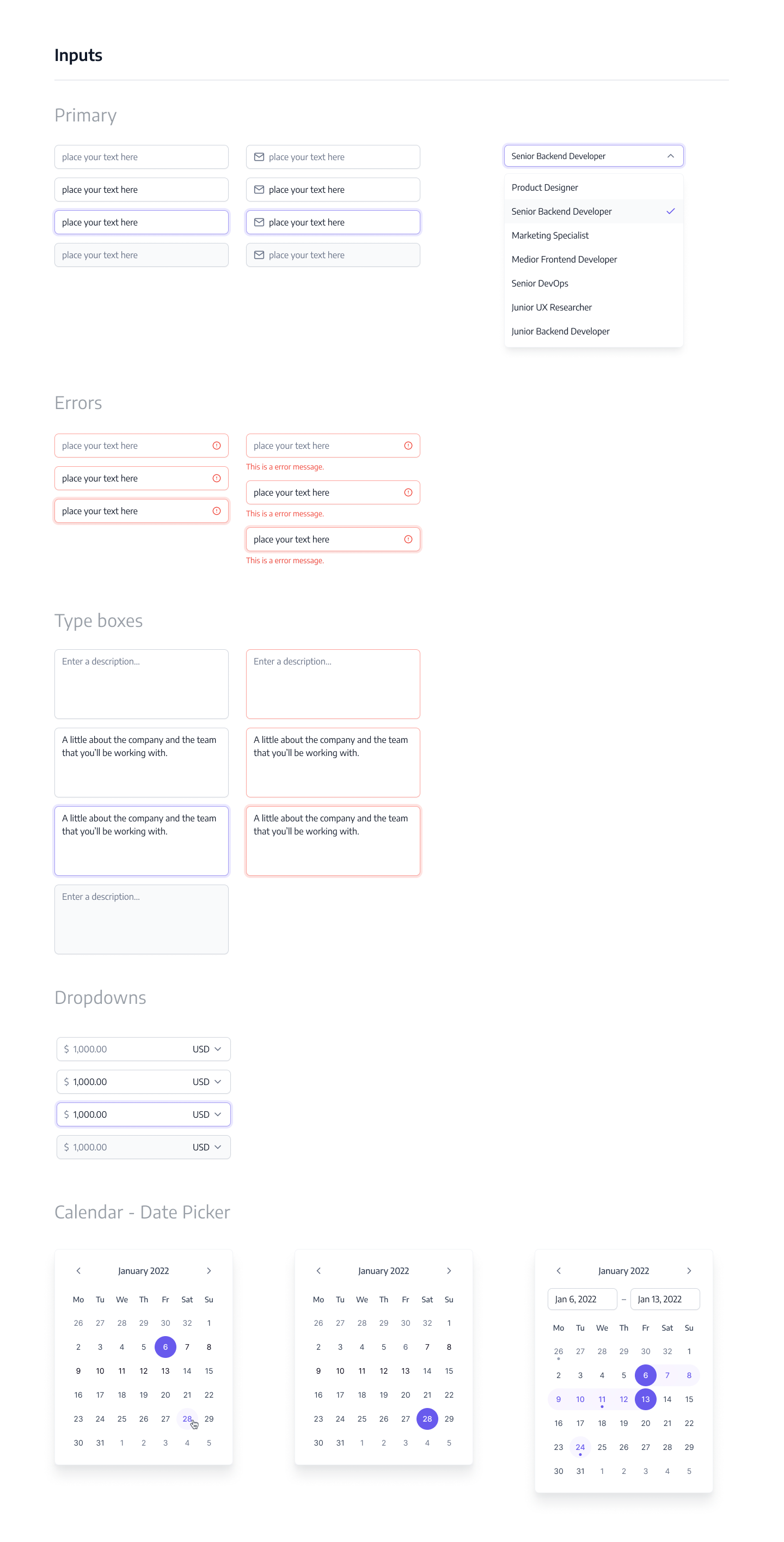
As the application was quite large with so many font sizes, colours & interactive elements we created a Design System with reusable components in Figma.


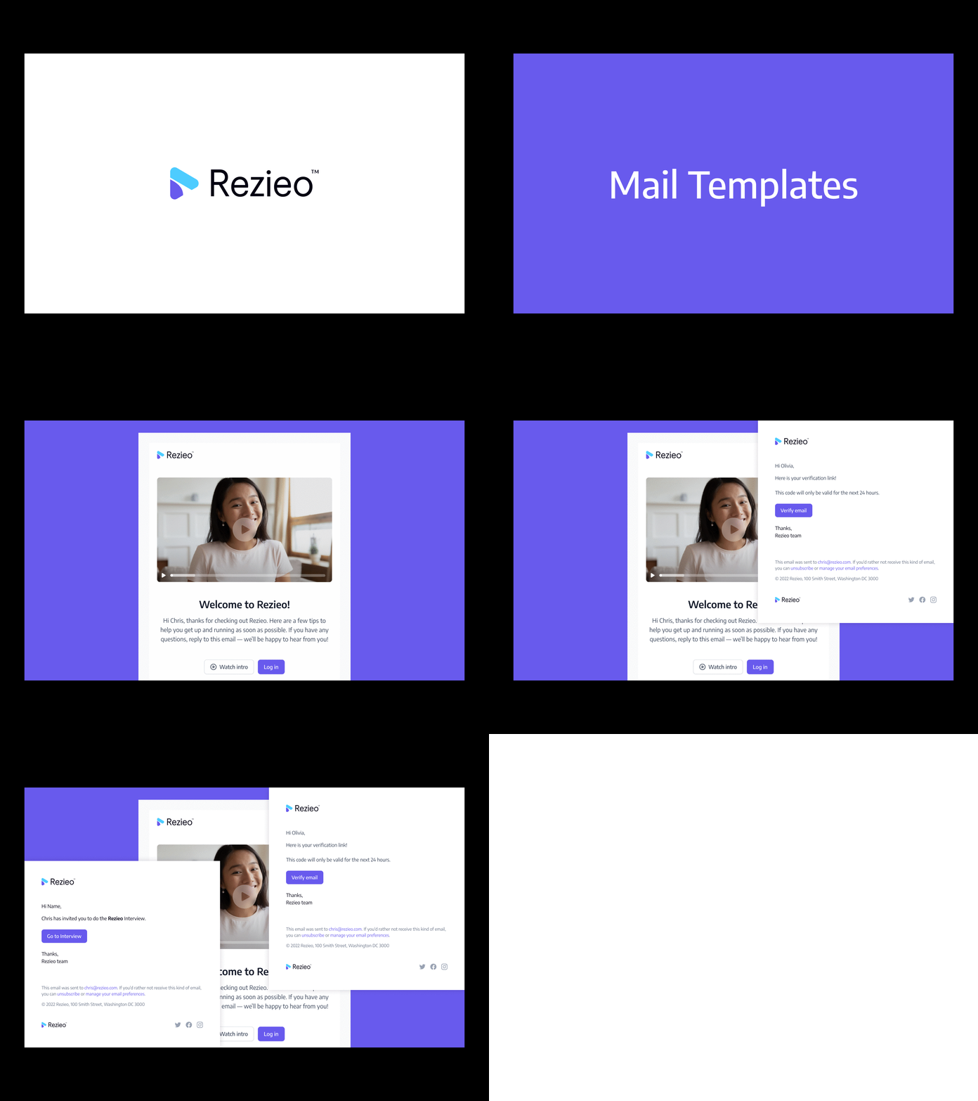
In the end I created the e-mail templates for the onboarding process, etc.
